(Archive) Advertising District / Dump-Place
-
 19-April 07
-

 Dotrobot
Offline
I personally think the line is too short for a major ride like that. But really nice idea. Station is great too
 -

 nin
Offline
@ musicman: what is a switchback?

I wouldn't go so far as to say that is the best themed queue ever, but the idea is brilliant. -

 djbrcace1234
Offline
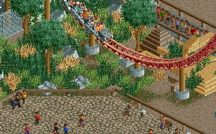
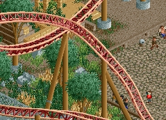
Sand areas are unfinished..
I can make the Cameraman (red peep) animated, because I found all the images to make it, but for now, it's only a quarter tile piece. I've always wanted to have a photo spot with an entertainer though
-

 K0NG
Offline
Looks real nice dj. The only issue I'd have with it is that the fence seems like it wouldn't be much of a deterrent for a small child (or an idiot) from taking on the wrong end of a speeding train. Particularly noticeable in the 2nd screen.
And, a "switchback" is a series of hairpin turns or zigzags
-

 ACEfanatic02
Offline
+1 The fence itself is fine, but you should have another (higher) one around the low-zones of the ride.Looks real nice dj. The only issue I'd have with it is that the fence seems like it wouldn't be much of a deterrent for a small child (or an idiot) from taking on the wrong end of a speeding train. Particularly noticeable in the 2nd screen.
-ACE -

 J K
Offline
DJ - Looks awesome dude, I love the idea for the camera with the photo-spot. Keep it going buddy!
 -

 Pacificoaster
Offline
The colors are drab, those trees are redundant and the coaster is too easy to access from the path.
 -
 petrol
Offline
any advice on how to with woodies.. i did a lot of tries buttah... i kinda suck at making woodies
-

 Roomie
Offline
A very early and rough version of a concept I'm trying out
Lots to do on the insides but the idea is there. -

 musicman
Offline
@petrol: try rounding off the top/bottom of your larger hills (any more than 50 feet) and change the section with the tight helixes. Other than that, it looks pretty good!
@Roomie: technically impressive, but somewhat unattractive in my opinion. -
 tdub96
Offline
Could that be inspired at all by Thunder Dolphin? Either way, its still very impressive.
 -

 Roomie
Offline
its certainly very rough
 I will probably slope the "9" shape into the roof as i think that will make it stand out less. I might also replace the brown sloped paths with Shop tops like I have over the main entrance (out of shot). The paths here look a bit rubbish.
But as I said I only started this a few hours ago. So any thoughts and ideas on how to improve the asthetics would be much appriciated. its nigh on impossible to get big good looking curved structures in LL unfortunatly.
PS: yes it is somewhat inspired by Thunder Dolphin... however Robbie92 has informed me that Lightning Whale is a terrible name though
-
 Coaster Ed
Offline
Roomie, you're awesome. That's about all there is to say about that. Who would have thought the wooden fences and the brick wall texture are exactly the same color? Those unbanked turns scare me because I know you like your rides fast, but I trust you know what you're doing there.
Also...how did you get the brick walls sloped like that? Is that some cloned-object codex trickery?
 Tags
Tags
- No Tags

