(Archive) Advertising District / Dump-Place
-
 19-April 07
-

 Six Frags
Offline
Nope, I did what was in the tutorial, but when I went back in game just nothing happened.. Maybe it just doesn't work with my version or something..^ You couldn't get the working invisible entrances without Modified working?
Really?
Took me something around 10 minutes to do.
SF -

 Camcorder22
Offline
Perhaps hes talking about sinking with SoB. Thats pretty easy as long as you dont have any other objects on the tile.
 -

 nin
Offline
hey
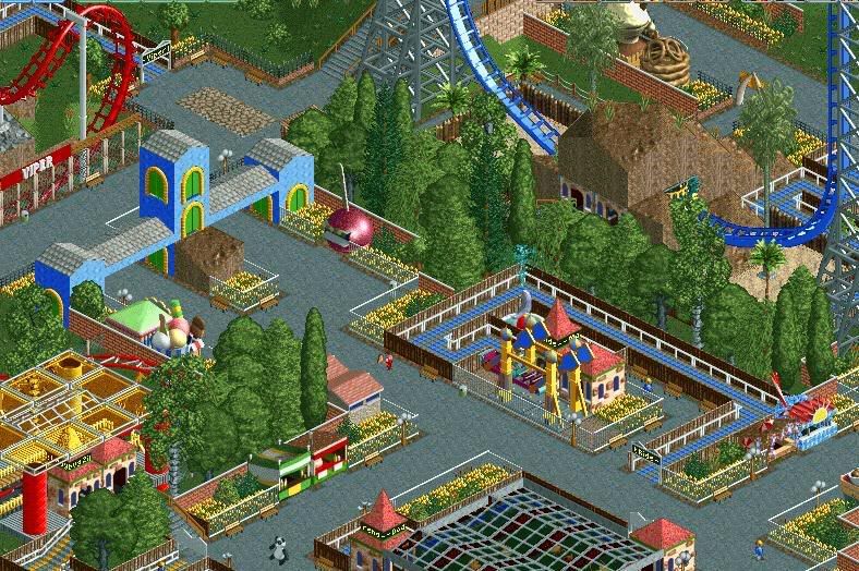
i've just been messin' around with the SFMM park and making it the SFMM park i want it to be rather than that shit-tacular version that came in the game. it's not necessarily a recreation of the park, but just a version of how i'd like to see the park. so, yeah... here's a little teaser of Viper.
peace.
scenarios seem to be the new trend lately
-

 Lloyd
Offline
Maybe 5 minutes.
I'm not a big fan, the colours aren't working for me, and i just find it a little boring. -

 Steve
Offline
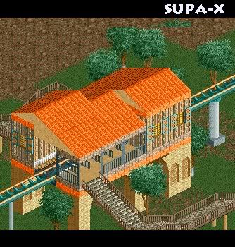
That looks excellent. The surrounding foliage seems to work, but I'm not sold on it entirely. Change the green door and those tan fences.
 -

Rhynos Offline
I agree with Steve here. Thing that bothers me the most is that it looks like there's only sparse vegetation and that I can see the hillside a bit too much. IS there anyway that you might change that? -
![][ntamin22%s's Photo](https://www.nedesigns.com/uploads/profile/photo-thumb-221.png?_r=1520300638)
 ][ntamin22
Offline
things that bother me-
1- the green door
2- windows on every available surface
things that don't bother me-
everything else. -

 SUPA-X
Offline
ok so when i tried to check this page out this morning it said it was all hacked and everything.
what happend? -

 Carl
Offline
^ The home page was hacked, it might be affecting the forums, too, cause I had some broken links as well. Seems to be working now, though.
Liam, excellent screen, except the wheel is a little out of scale, but I dont know what else you could use for a smaller wheel, but you could make the house just slighty bigger instead to counter this. -

 trav
Offline
I guess I'm the only one that doesn't like that?
I don't like the green door, red windows, or the fact that every wall has a window.
Also, I don't like the foliage at all. -

 CedarPoint6
Offline
Seems like a bit much path... perhaps break it up with planters. or just tighten it up. For the size of the building, it just seems overpowered by the path. Still, a nice looking building, although the curved awning doesn't go with the rest of the stuff since nothing else is curved. You might also want to make the building taller to fit with the tall sign out front.
 Tags
Tags
- No Tags


