(Archive) Advertising District / Dump-Place
-
 19-April 07
-

 Austin55
Offline
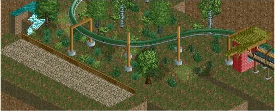
Yea, especially the second helix, it just doesnt make for a great opening to that ride with two huge right turns in a row.
 -

 JDP
Offline
this is great@Chillsons, stop making the coaster turn right! Have some helixes go the other way.
-JDP -
 petrol
Offline
hi.. so just wanted to know what you guys think of this queue-line
i made it so it looks a little like a race track
PS: i was wondering if there is anyone that wants to remove de entrance and exit for me plz
-

 petrol
Offline
@ louis! i'll try to excecute it better
@ sssammy: disneyland? i was actually going for a sort of cedar creek/ six flags brand but with my own touch.. -

 posix
Offline
I think it's nice but it looks very similar to CP6's park. I would add handrails to make it more clear this isn't intended for racing.
 -

 petrol
Offline
six flags carolina yes.. cp6 must be cedarpoint6? well maybe the queue line but not the overall coaster i think
@CCI i dunno it's a little hard to judge, but i like the color scheme and the custom supports you made
new queue line

-

 J K
Offline
Best themed queue line I've ever seen. It's inspiring as I really need to improve this in my game.
 -

 musicman
Offline
I'd put a tire in the curves where the cornermost (yes, I did just make that word up
 )bushes are: If you think in terms of a real race track (which this isn't I know, but still...) that's where they would be most needed anyway. Also, it seems rather short for a ride of this scale: I wouldn't make the "track" portion any longer, but maybe some additional switchbacks in the station. I assume you already see the texture problem.
-

 Luketh
Offline
Throw some brighter colors in those flowers, man. Otherwise that's a really cool idea! Personally I don't like those tire objects but I guess that's just me.
 -

 petrol
Offline
@ musicman: what is a switchback?
 is it like a piece of track that connects the 1 track with another if the are next to eachother?
 Tags
Tags
- No Tags

