(Archive) Advertising District / Dump-Place
-
 19-April 07
-

 Liampie
Offline
I immediately saw the influence. Always makes me proud!
There are two things I don't like about the layout. 1, the straight piece after the station and the incomprehensible transfer track. 2, the ride consists mostly out of turns and the whole ride feels like a single 'drop'. It needs more adventure. I know that's hard to do though, if it wasn't Piraña would'nt be a design but part of a bigger park with a finished bobsled. -
 Timothy Cross
Offline
Can people please just show the image in their post? This is the internet.. the lazy man's life.
 -

 Pacificoaster
Offline
@musicman: maybe try doing a double cork screw element then into 4 zero g rolls
 -

 highroll3r
Offline
looks good mci. change the colour on the dark brown wooden walls to a lighter brown to show the wood texture.
 -

 Super G
Offline
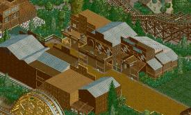
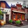
A new screen:
The Entry, with the ticket boots (16 in total) and the Mainstreet (not finished)
EDIT: A second screen:
The office for the desiners. -

 Timothy Cross
Offline
Some of your buildings need work, but I love the entrance. Though, work on making paths less square without so many right angles.
 -

 Super G
Offline
If you mean the second screen, I'm not gonna change that because it's for personal only.
 -

 chorkiel
Offline
on the second screen I'd make the ''serre'' not with like 2 points but one flat glass roof.
at the first screen I wondered what the ice was for xd -

 Timothy Cross
Offline
If you mean the second screen, I'm not gonna change that because it's for personal only.
I know, it's just that even inside the park you use right angles. It's boring, -
 Chocotopian
Offline
I like the warmness of the ticket booth area. I think the browns and deep red work well.
 -

 Super G
Offline
@ Fantastico: How do I do that? I've never workt with unsightable paths before (I've got him in the park though)...
 -
 Luketh
Offline
Eeeh, try the dark purple for the supports, right now both of those colors have the same uh.. whatever the proper word is.. tone, I guess? And they don't blend or look good together; they just.. clash with each other, y'know what I mean?
I love the half brick/white building in the background though, it looks awesome and I think you've pulled it off really well!
-

 highroll3r
Offline
cant change the support colour sorry. they would be a pain in the arse to do again. im glad you like the brick change on the first aid services i tried so many different quater blocks to get the right texture and blend.
 Tags
Tags
- No Tags
