(Archive) Advertising District / Dump-Place
-
 19-April 07
-

 K0NG
Offline
gijssie, while I still love where your screens appear to be going...I'm also still curious as to what we'll see when you reach your destination.
 -

 Wanted
Offline
Not feelin' it anymore. I want to see something completed instead of this unfinished stuff.
 -

 K0NG
Offline
^ I want to see people that register for poker tournaments actually sitting at the table
-

 musicman
Offline
^I want to make a snotty comment about K0ng's snotty comment, but I can't think of anything, so here is a bunny instead.
(\__/)
(='.'=)
(")_(") -

 K0NG
Offline
I think you were just looking for an excuse to draw your bunny...my comment wasn't 'snotty' at all.^I want to make a snotty comment about K0ng's snotty comment, but I can't think of anything, so here is a bunny instead.
(\__/)
(='.'=)
(")_(")
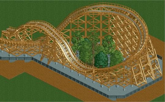
CCI: Looks good but, I'm not sure about a slab of concrete surrounded by path with a mini forest in the middle.
Nokie: Not bad. Not sure why you'd have a log flume slightly elevated above a body of water...but, not bad. And, where's my fucking sandwich? -

 CCI
Offline
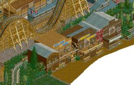
So are you saying it would look better without the concrete? I'm not really liking those houses.
 -

 djbrcace1234
Offline
Take the trees out, CCI, If this is a GCI, it would just be on a concrete slab if it was the same elevation, of course. The trees don't add much really to make it seem more vibrant.
 -

 Nokia
Offline
Nokie: Not bad. Not sure why you'd have a log flume slightly elevated above a body of water...but, not bad. And, where's my fucking sandwich?
I ate your sandwich, and it's supposed to be like a little canal when like the log goes down and the water comes out the sides
-

 Insanity
Offline
@ CCI: the trees don't even look like they're supposed to be there.
P.s. feelin sad because today's my birthday and I don't remember how to upload pictures
-

 Super G
Offline

A kiddy woody. What do you think? (Theming not done only the custom supping is finished). -

 Dark_Horse
Offline
Super G, that's a nice simple layout. The only thing I would suggest is raising the turnaround after the second camelback.
 -
 highroll3r
Offline
Liampie's Pirana inspired me. :-)

it was one of my fav things about pirana. chillsons it does look too similar to liams though.
 Tags
Tags
- No Tags
