(Archive) Advertising District / Dump-Place
-
 19-April 07
-

 Cocoa
Offline
trav, whats wrong with doing it the efficiant way if it just looks the same? It's probably not that hard for someone like parkitect or levis to make a trainer where you can chose from different g1s.
 -

 Camcorder22
Offline
Yeah, and its a real pain in the ass to try to sink entrances and exits when theres scenery above them (micros eg), when you could spend time on more worthwhile details and hacks.
 -

 Turtle
Offline
This same argument comes up every time someone makes a new tool for any of the games, and the people who previously enjoyed the status of being the only people who could do a certain trick complained about the tool, saying it was going to ruin the game. Happened with the Beast, Son of Beast, 8 cars and the codex to some extent. There will always be people who use the tool better than others, and that will still show in the work being done. Just because this tool gives people a blank canvas to build a station doesn't mean that everybody's going to be able to build a nice one.
 -

 Midnight Aurora
Offline
Since the Drexler patch first came out, it didn't matter what aplication was used because they could all be seen in game. This one causes you to alter how the game is played, so that one person with it sees blank stations, but ruins every park that came before the application, and everyone without it can't properly view anything with it.This same argument comes up every time someone makes a new tool for any of the games, and the people who previously enjoyed the status of being the only people who could do a certain trick complained about the tool, saying it was going to ruin the game. Happened with the Beast, Son of Beast, 8 cars and the codex to some extent. There will always be people who use the tool better than others, and that will still show in the work being done. Just because this tool gives people a blank canvas to build a station doesn't mean that everybody's going to be able to build a nice one.
-

 CedarPoint6
Offline
So switch them before you view old parks... it only takes a second.
I'm building my parks so they can be viewed either way. There's very little to complain about with this.
Anyway, that screen way up the page is really nice-- I like the structure and the path up the mountain is very well made. Looking forward to the expansion of that area. -

 tracidEdge
Offline
What in the fuck are you guys going on about. Don't be pussies.
Nice church up there. Sophisticated looking. I like it. -

FullMetal Offline
Nice church! (Or whatever you want to call it!) It makes good use of the color brown, I think. -

 Six Frags
Offline
That got me thinking, why don't we tag parks that use RCT Modified, like "[RCTMod] Classica Gardens by Six Frags"..So switch them before you view old parks... it only takes a second.
I'm building my parks so they can be viewed either way. There's very little to complain about with this.
That would make it easier if you're loading saved games to see if it uses RCT modified..
Anyway, I like your screen wallyworld, I think the colour of the topspin makes up for the lack of colour on the architecture..
SF -

 Camcorder22
Offline
So theres still floating closed signs with RCT Modified? The building design looks nice, but theres way too much of the same color. Maybe if you threw in some different colored different texture blocks and a few more details that are colored differently, it would look a lot better.
 -
 WallyWorld
Offline
thanks all, I will try to add more bits of color here and there. Maybe even try to box in the scrolling sign somehow.
 -

 Six Frags
Offline
Yes, but that's the only downside for me..So theres still floating closed signs with RCT Modified?
I've tried the hex hacking, but I just can't get it to work properly.. Took me about a hour (after which I entered my boiling point), that I just basically wasted, and could've put into the park..
SF -

 Fr3ak
Offline
^ You couldn't get the working invisible entrances without Modified working?
Really?
Took me something around 10 minutes to do. -

 Drew
Offline
hey
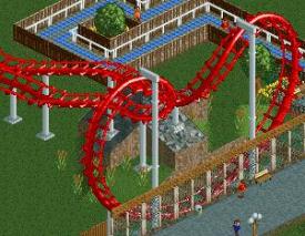
i've just been messin' around with the SFMM park and making it the SFMM park i want it to be rather than that shit-tacular version that came in the game. it's not necessarily a recreation of the park, but just a version of how i'd like to see the park. so, yeah... here's a little teaser of Viper.
peace.
 Tags
Tags
- No Tags


![][ntamin22%s's Photo](https://www.nedesigns.com/uploads/profile/photo-thumb-221.png?_r=1520300638)

