(Archive) Advertising District / Dump-Place
-
 19-April 07
-

 petrol
Offline
@ chorkiel, that's the idea. at the top of those towers there only is a stairway to the bell part.
 -

 wildroller
Offline
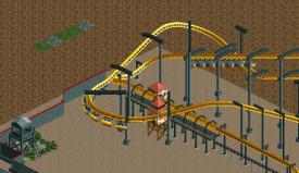
Well I built a reasonable Arrow Suspended today, currently working on building the supports for the project, inspired by a LL photo by Peirrot early in the dump place. Would like some feedback on the supports before I work on the compact part of the layout
 . Thanks! Also you can see part of the theming taking place for this design!
-

 Hex
Offline
That little tower is awesome, but I don't care for the top of the supports. The monorail doesn't look great with the other supports.
 -

 wildroller
Offline
That little tower is awesome, but I don't care for the top of the supports. The monorail doesn't look great with the other supports.
Yea, the other supports don't go with the suspended track though
-

 K0NG
Offline
Yeah, those supports just don't work for me at all. They're way too top heavy to begin with....and, I have to wonder why you'd go in that direction when you have so many options available for custom supports in RCT2 anyway.
 -

 Insanity
Offline
@walto, i'm loving the detail of foliage, but I don't like the paint job very much: too generic (behemoth, farenheight, & talon for example)
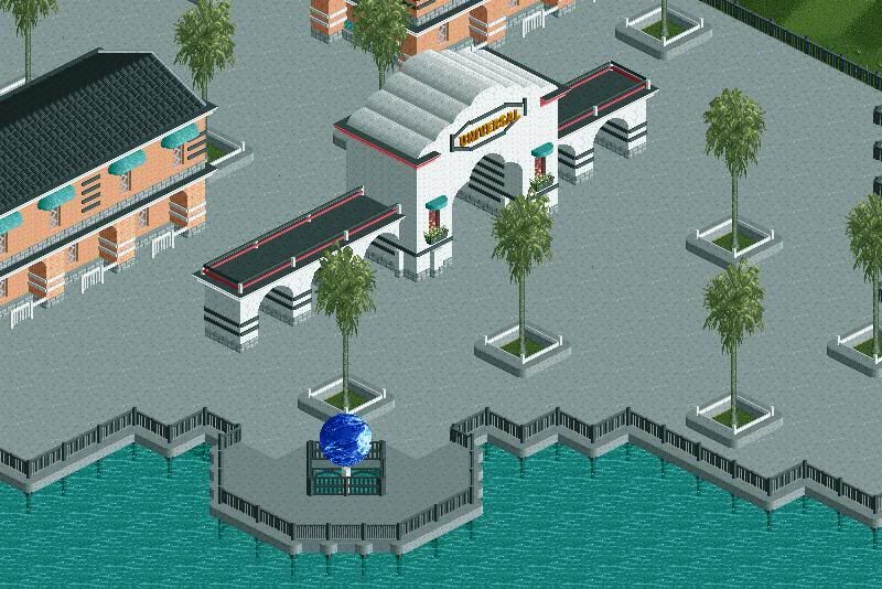
@Werner: I love your Globe!!!! but change the color of the path into a pattern, like of red & tan or something like a real universal. -

 Dark_Horse
Offline
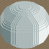
I like that higroll3r. It's very charming, even with the dark colors. I think the "dome" could use some more work though.
Dark_Horse goes super old school -
 Timothy Cross
Offline
I don't think you're going "super oldschool". I think you're just using LL as an excuse to work below par. LL actually has a higher standard than RCT2 as far as expressing ideas is concerned..
There's so much bad in that screen.. no offense, I just think RCT2 is your game.. -

 Luketh
Offline
Walto, that is peeerfect. I love the business, foliage, rocks, colors, landscaping.. It all blends really well into an awesome screen. Can't wait for more!
-

 SSSammy
Offline

hey dh, here's some thoughts and crit from myself.
first of all, the 90 degree turn. think about it from a peeps perspective. you're walking along, you get a nice view of the back and side of a main architectural landmark on the map.
does this look attractive to you? it wouldn't to me from a critical standpoint. it wouldn't happen, and when you can create such masterpieces in games like this, it pays to pay attention to these things. also, instead of being lead into the building via some beautiful element of flow, guests are forced to make a complete 180 from the way they were walking to enter the building. not happening, is it?
next, the blue arrows. this is the way the guests have to look when viewing the building. yet there is minimal path that looks into the face of it. i'd recommend making the area infront of this building into a loverly plaza area. this way, guests eyes would be naturally brought unto the building, as opposed to the sudden surprise that this building is somehow relevant. (if it isn't relevant, why is it there?) if a plaza was part of your plan, why make not make the queue so short? guests would rather be queuing for hours than not getting on the ride cause the queue is full.
the yellow sightlines are what the guests can see. at the moment, that is all they can see when they reach the sharp, drastic right. as i mentioned before, it's all about the park doing all the work for you, not the other way around. you have virtually limitless ways in which to make a park, why make it difficult for our paying customers, am i right?
maybe bringing the path a tile away from the building and fenching of some decorative foliage may create a greater sense of depth. also, the plaza idea is also good for this purpose. whether it is a functional or a purely aesthetic plaza is completely at your discretion.
two last critisisms before i get off your ass. I like the transfer shed. very clean and functional... but why is it plonked directly on the path? if that is a service road then why is the ride entrance on a massive dead end? that is fatal for park flow in my personal opinion. the station needs work, as well. it seems you are looking for a wooden style of cabin esque architecture. why is there a concrete flowing work of art on the roof? why is there SAND up there? it's things like this that can make or break the believability of what you're building.
finally, i'd like to say well done on what i can see of the coaster. that diag lead intot he station looks great. i love diagonals and it's used really well there.
i hope you don't take this as me ripping you a new one, it's me trying to aid your understanding of the game on a higher level. if you don't like what i said, don't follow any of my advice! i was just hoping to trial a new style of reply, what does everyone else think, btw? hope this can be of assistance DH!
walto: cracking screen bro. -

 Dark_Horse
Offline
Thanks for the tips, Sammy. I'm glad you took the time to reply, because it was actually quite insightful and thought-provoking. I will definitely consider working on some of those things as this progresses. In case anyone was wondering "super old school" = Vanilla RCT/No CF/AA/LL, and no Codex/ZCing.
 -

 Cena
Offline

Just made 3 new objects tonight and used them in my park but I want to know your opinion on this
Thanks
 Tags
Tags
- No Tags

