(Archive) Advertising District / Dump-Place
-
 19-April 07
-

 K0NG
Offline
I'd say make all the railings black, change the underside of the crown pieces to gray (actually black..because they color lighter than what you apply) and stick with one shade of blue.
 -

 petrol
Offline
hi.. i attempted to make an rct2 version of a dutch churchtower. main source of inspiration:
http://vakantie.pagi...artinitoren.jpg
here's the pic:
-

 highroll3r
Offline
looks nice petrol. the real one has a black fence tho. plus it will look much better if you build the rest of it.
 -

 petrol
Offline
looks nice petrol. the real one has a black fence tho. plus it will look much better if you build the rest of it.
i tried that at first but didn't make it look any better and it's not a recreation
  it's inspired by.. but! the rest will come
-

 chorkiel
Offline
looks really good though I don't like how the 3th floor (rightaway under the statues) lookss like it's the thickest.
 -

 wildroller
Offline
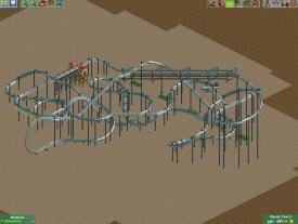
Well, I started out wanting to make a nice small project just to finish something but ended up with this flyer layout that is pretty nice I think. Working on supports now (can see a few on the lift hill). This started out planned to be part of a 20x20 park, but I kept saying just a few more tiles and here we are, quite a bit bigger than 20x20! Coasters name is Test Flight and feature 4 inversions! I do have plans for the theme, however I gotta figure out how to make a decent UFO (needs to be like 7x7 tiles) to make everything the way I want!
Anyway feedback on the layout would be appreciated! -

 Midnight Aurora
Offline
Pretty obvious I bit off more than I could chew by trying to do this in LL.
I'm hitting a brick wall here, as every single piece I add on to this requires me to come up with a new way to solve a problem, as there's almost no useful diagonal pieces in LL. And the supports should be positively awful...
But yeah. This seems like the most realistic way to recreate Deja Vu. Pretty odd to me that nobody has ever thought to do it this way... Feel free to rip off my ideas, because I'll never fucking finish it. -

 Phatage
Offline
I think it's awesome and that you should keep going, are you able to get it working with that diagonal station? Also, I think you should make the large half loops go in towards each other with no straight track in between the corkscrews as I think it will look and behave like the real thing even more.
-

 Midnight Aurora
Offline
I don't see any reason why it shouldn't be able to be made operational--I just didn't feel like taking the time to make it happen when it's pretty obvious that I won't finish it. More of me just throwing the ideas out into the community.
 -

 Cocoa
Offline
MA, I would consider (granted its not operational) turning the track on the vertical spikes around 180 degrees. It would look better and match up with the supports. Nice work on the station though, and it is actually quite beautiful.
 -
 gijssie1234
Offline
Pretty obvious I bit off more than I could chew by trying to do this in LL.

I'm hitting a brick wall here, as every single piece I add on to this requires me to come up with a new way to solve a problem, as there's almost no useful diagonal pieces in LL. And the supports should be positively awful...
But yeah. This seems like the most realistic way to recreate Deja Vu. Pretty odd to me that nobody has ever thought to do it this way... Feel free to rip off my ideas, because I'll never fucking finish it.
http://www.nedesigns...opic=21588&st=0 here you can see a good one
disneylandian192 like it, when did you show the coaster underneath??
-
tdub96 Offline
^this is LL, not Rct2. It's a bit different to make a GIB, correct me if I'm wrong on this as im not a LL'er. -

 highroll3r
Offline
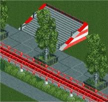
nice colour choice. might use that one myself as people think im over using red, white and black. i think the umbrella colour are
 . no pole or benches either. the building seems more like a fascade. by this i mean it looks like it just stops by map edge. it looks like its been cut in half the tall bit. any way the colours are good ecept for the umbrellas. ive seen much better architecture from you with that building you posted here a while back.
-

 chorkiel
Offline
@petrol, het lijkt alsof die verdieping onder de standbeeldjes het dikste is van allemaal zegmaar. (meer vierkante meters en niet alleen in de hoogte)
@disneylandian, THAT LOOKS AWESOME !
 Tags
Tags
- No Tags
