(Archive) Advertising District / Dump-Place
-
 19-April 07
-

 SSSammy
Offline
not feeling that at all highrolla. it's too tight on itself, the loop around the lift hill is waaaay forced. try abandoning the initial drop, and seeing if it comes naturally with the flow.
 -

 chorkiel
Offline
mine why?
I think I know them (i live near the strabrechtse heide)
+ I'm just wondering xd -
 petrol
Offline
it's pretty cool... but i don't like the magnolia trees. they kinda look out of place
 -

 Super G
Offline
My first screen ever on NE. I hope you like it!
And Yes I know there are ghost objects in there. I'm gonna delete them when I'm in the mood for it

-

 Hex
Offline
I hate the layout, I'm sorry, it has OK support work, could be better, could be worse and im not so sure about the colors.
 -
 Pacificoaster
Offline
I hate to be so blunt, but that layout is awful, the colors are awful, and the support work is awful. However, you seem to have potential. The courtyard in the top of the screen looks decent.
 -

 J K
Offline
I really don't think it's as awful as you guys are making out. Unconventional, yes but this layout can be easily built on. Congrats on your first screen here and I hope to see more from you!
 -
 Luketh
Offline
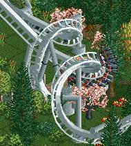
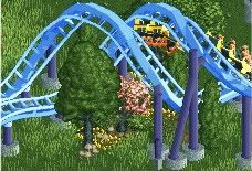
New Element, I was messing around and created.. A new element!
 Might use this on something.. I really like how it goes straight to the breaks. A leeetle unfinished up at the very top right. You guys like it?
-

 Liampie
Offline
It's not really a new element...
But that's not important. It looks pretty cool here I guess... (why is the screens so fucking small? ) I like the colours of the coaster a lot too. The only thing I don't like is the pink tree.
-

 RCTNW
Offline
Am I missing something? What is the element? it looks like interlocking corkscrews to me.
 -

 JDP
Offline
^its half corkscrew into a heartline roll. not a very popular element and would probably only be used by Maurer Söhne but i can also see mack getting in on this...and maybe intamin.
And pie needs a high 5 for the photo
-JDP -

 Austin55
Offline
I just cant see that element working well on rides with longer trains. Something like a Eurofighter might cruise through it better though, but im probably wrong.
 -

 JDP
Offline
^^Nah man your 100 percent right. its for a low capacity coaster that doesnt get too high and stays near ground level. i also think a lot of it had to do with Maurer Söhne pulling some tricks out of their hat for more innovative coaster design
-JDP -

 Luketh
Offline
Wow, thanks for all the comments guys! The train cruises through the element at a normal corkscrew pace and then hits the breaks right after the train finishes the half barrel roll. I really like the placement of the element on the ride because I can see it being such an unexpected finale to the ride for the riders.. They're crusin through, WOAH! Corkscrew! Turn around and they're expecting another corkscrew but all of a sudden they flatten out and hit the breaks, leavin' riders a little dizzy as they try to figure out why the hell they just stopped.
But yeah, it was just an idea that I probably will recycle if I can ever fit it into a coaster 'cause it looks great at the pace I have in-game.
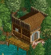
MCI: I really like that archy. I'd ditch the brown lattice wall at the station that's on the window, though, it doesn't really seem needed.
-
 Maverix
Offline
Luketh that's very nice
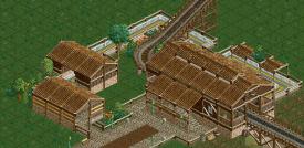
MCI: Not bad though I'd fill in the area between the buildings with so foliage.
Here's something new from me: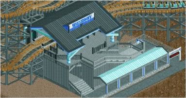
Unfinished, just looking for some comments on the station. -

 Dotrobot
Offline
I don't know. It's so... grey. Especially against the gray supports of the coaster. Maybe spruce up the walls with corrugated steel light blue stripe(s)?
 Tags
Tags
- No Tags

