(Archive) Advertising District / Dump-Place
-
 19-April 07
-

 Cena
Offline
thanks... buttah when i try to recreate the ride so that i can connect the paths i got an error trapper and now th foliage is gone

En je vind het nog vreemd ook? Je hebt hier een hack met onzichtbaar spoor, als je daar weer aan wilt bouwen, moet je het eerst weer zichtbaar maken met 8cars. Oh, en sla altijd om de 10 minuten op, met een nieuwe naam voor je savegame.
Dus: savegame park1, savegame park2, savegame park3 en zo verder. -
 petrol
Offline
En je vind het nog vreemd ook? Je hebt hier een hack met onzichtbaar spoor, als je daar weer aan wilt bouwen, moet je het eerst weer zichtbaar maken met 8cars. Oh, en sla altijd om de 10 minuten op, met een nieuwe naam voor je savegame.
Dus: savegame park1, savegame park2, savegame park3 en zo verder.
thanks buttah i did al that.. but i got error trapper cuz i changed back to normal track
except for saving every 10 mins
-

 Midnight Aurora
Offline
infinitely better, petrol. if you could do something to address the squareness of the paths, you've got a winner.
 -

 Imi
Offline
oops, i have posted that screen in the wrong place, that is not actually my park i just wanted to show you guys how good it was. sorry guys.
-

 Louis!
Offline
Petrol that foliage is really well done, really capture the escence of the photos you've been inspired by. I agree about the squareness of the paths though, perhaps zero-clearance some foliage over the paths (just the odd few bits) just to combine the paths and foliage together.
 -
 highroll3r
Offline
i requested it before. having fun made them for me but there really akward. go on advanced search and select custom scenery exchange and type in diagonal crown moulding
 -

 petrol
Offline
thanks louis!
 and i found it highroll3r
  thanks.
buttah i am gonna start a new park. i want to recreate walibi world in holland or cedar point (not sure yet). cuz i suck at consistency. so by taking my time with 1 of those parks. i think i can really learn alot about that and foliage. also. custom support also is not my strongest site. but i think i really am getting the hang of it .
.
if i learned about that i think i am going to continue with the park i am posting screens of. Still just need to learn to much for a real good themepark
-

 petrol
Offline
petrol, are those the strabrechtse heiden ?
(what park are those pics from ?)
mine why? -

 djbrcace1234
Offline
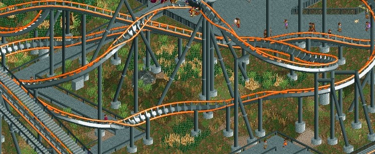
Just a project for a contest at Tpr. Any suggestions? By the way, It's a B&M Wing Rider. -
 Luketh
Offline
... try to make it [the foliage] flow more.. real plants grow in kinda.. clumps.. y'know, There'll be a few trees and then the grass and the flowers and shrubs grow around those trees. There needs to be more height and color variation as well. Hell, try looking at pictures of REAL foliage in parks to get a feel for how to make it "flow."
I told Petrol all of this in the dump earlier, djb, and I think it applies to you as well. Throw a few trees in there! little shrubs tend to grow around trees and in clumps, not randomly on the ground.
The supporting looks pretty good, though. I'd fix the way the catwalk looks like it's floating next to the lift hill, though, 'cause that looks a little strange. You can always use the 4-D coaster if you need a good catwalk. Also, pop some awnings on that queue, imagine being a peep waiting in line on a hot day.. the sun's gonna scorch you without a few little coverings along the way.
Keep it up, though, and good luck in that contest!
-

 RCTMASTA
Offline
I have to agree with Luke on this one.
-Removed-
Sorry Luketh. Some bullshit is better left unsaid, this included. -

 Luketh
Offline
I have to agree with Luke on this one.

It looks nice to many people on sites like [anywhere else], however under the realism-favored eyes of many New Element parkmakers *coughcp6cough* *coughlukethcough*, Fantasy shit (with the exception of GOOD fantasy shit a la Levis) is not as common.
It's not so much REALISM that my eye, or even most of the community's eyes favor. The game is all about aesthetics; what looks good? How can I find a balance between what's real and what I'd like to be real? That's what RCT is all about -- turning concept to reality and making it look good. Not necessarily realistic. -

 Kumba
Offline
It's a yellow Kumba with no camel-back!
Nice tho, come up with a good theme and it can be a really nice design
 Tags
Tags
- No Tags


