(Archive) Advertising District / Dump-Place
-
 19-April 07
-

 petrol
Offline
wind mill or building below?Not a fan of the mix of plain slanted blocks and the pirate roofs. And foliage, as J K said, would probably improve it a lot. Other than that, it looks neat.
-

 petrol
Offline
if anyone wants to see the entire progress untill i started posting on ne here is the link to the topic in rcth
http://www.rcthollan...viewtopic/28628
ps: i'll see what i can do about the mill thanks for the hint
-

 Luketh
Offline
^I don't really like foliage try #1... try to make it flow more.. real plants grow in kinda.. clumps.. y'know, There'll be a few trees and then the grass and the flowers and shrubs grow around those trees. There needs to be more height and color variation as well. Hell, try looking at pictures of REAL foliage in parks to get a feel for how to make it "flow."
Also, you still have ZC on.
_____________________________________________________________________________________________________________________________________________________________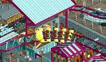
Tons of thrilling action on the best little coaster around!
Probably the last screen I'll show 'cause.. well.. it's a VERY small coaster/map and I don't wanna give too much away. -

 Jipalu
Offline
^Agreed it looks to manufactured, the windmill is fine the building below looks amazing, look forward to seeing how this progresses!
Luketh- Looks good, I like the colour scheme... -

 highroll3r
Offline
thats awsome but i dont like the bench by the footer. nice idea with the track and coaster trains. very influencial.
 -

 petrol
Offline
plz note that i try to recreate a heath atmosphere. so something a little like this:
but i shall ceap the tips about the flow in mind.
btw i really like that screen but not a huge fan of the collors of the coaster car pertaining to the track. but that's more of a personall opinion then quallity
PS: @ splitvision i can send you some screen of the benelux city area if you want -

 Midnight Aurora
Offline
@ petrol: the green ground texture is also foliage. That's what you should use for the type of low lying ground cover in the foreground of the picture you showed. Furthermore, Luketh is correct in that bushes and trees do grow in clumps. Both in height of the plants, and their composition. As in your picture, the grasses get taller as they flow into the pink plants, and the pink plants all grow together.
Your photo has very little depth as far as height goes, and is more or less random as far as plant type and composition is concerned. Dead grass is also probably not a good choice for a wet land, either. -

 J K
Offline
Lots of really good screens on this page, especially from the english builders
 Imi you crazy fool!!! Jipalu = <3
-

 J K
Offline
Looks good to me buddy. Those diagonals and foliage make the screen in my opinion and really compliment the structure. Just connect all the brown paths and you're set.
 -

 petrol
Offline
Looks good to me buddy. Those diagonals and foliage make the screen in my opinion and really compliment the structure. Just connect all the brown paths and you're set.
thanks... buttah when i try to recreate the ride so that i can connect the paths i got an error trapper and now th foliage is gone
-

 disneylandian192
Offline
Good thing you have a screenshot to rebuild from! It looks nice, but I'm not feeling the drainage. It's very square and just ends right under the bike path. Perhaps if it ended one or two squares earlier into the same type of collection you have on the other end of the drainage by the windmill. If you did that I think it'd be a lot easier to forget about the squareness of the rest of it.
 -

 petrol
Offline
the idea that the plants end in the paths is actually essential for the heath.
by drainage: do you mean remove the water tiles?
 Tags
Tags
- No Tags

