(Archive) Advertising District / Dump-Place
-
 19-April 07
-

 Croustibapt
Offline
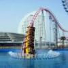
Bienvenue a DisneySea Paris. Avez un bon journee!
"Passez une bonne journée!" would sounds more correct. Nice try to french speaking, though!
Anyway, this is really great, robbie. You actually caught the disney atmosphere in this screen. It's absolutely beautiful, I like it a lot! -

 Liampie
Offline
Why do you say that RMM? They aren't any shorter than Patriot. I prefer #1
Patriot is too short.
Anyway I don't like both versions. The first one has an ugly corkscrew but elegant helices, the second has better corkscrew but ugly helices. The first half of the ride looks okay. I prefer the hill over the turnaround too. -
 LDW
Offline
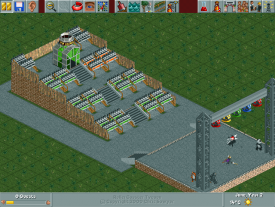
It is fine to post that screen here. Personally, I think the coaster cars for stadium seats is an unusual idea but it works perfectly. Maybe add some foliage though. Looking forward to more screens from you.
LDW -

RMM Offline
Why do you say that RMM? They aren't any shorter than Patriot. I prefer #1
imagine riding that in real life. i can't picture myself riding that and not saying at the end, "that's it?". -

 CedarPoint6
Offline
I suppose it depends on what kind of realism you're going for. Because if you look at real life inverts, a fair amount of them are pretty short. Talon, Patriot, any Batman, Nemesis, Nemesis Inferno, Flight Deck, Great Bear, Afterburn and probably even Silver Bullet could fit into that length range.
That said, while I feel the length is appropriate, I think you should work on the flow after the immelman. The helixes look nice in the first, but work on making the corkscrew a little smoother. With that, I think you can have a good layout. -

 JDP
Offline
^^not bad but i dont know why everyone has to be so messy when it comes to ncso parks
-JDP -
tdub96 Offline
Here's some more of my TPR contest entry. The coaster is Alpine Express, the park: Matterhron Valley AP. Comments welcome!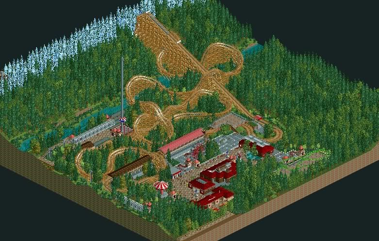
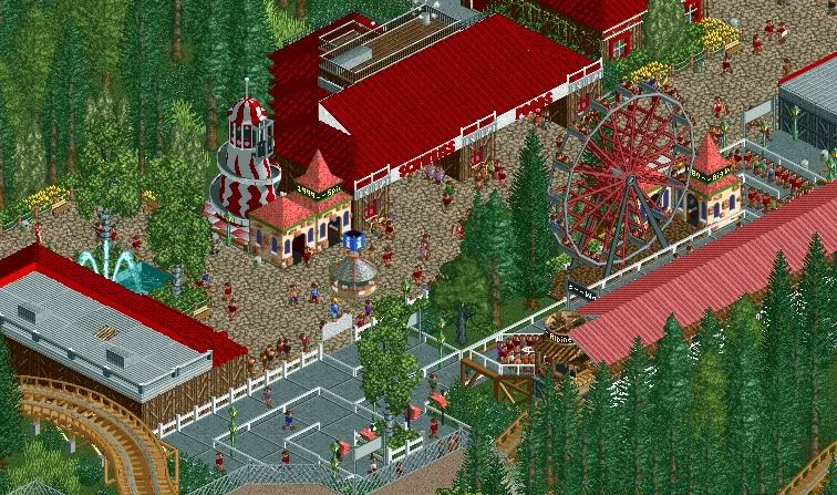
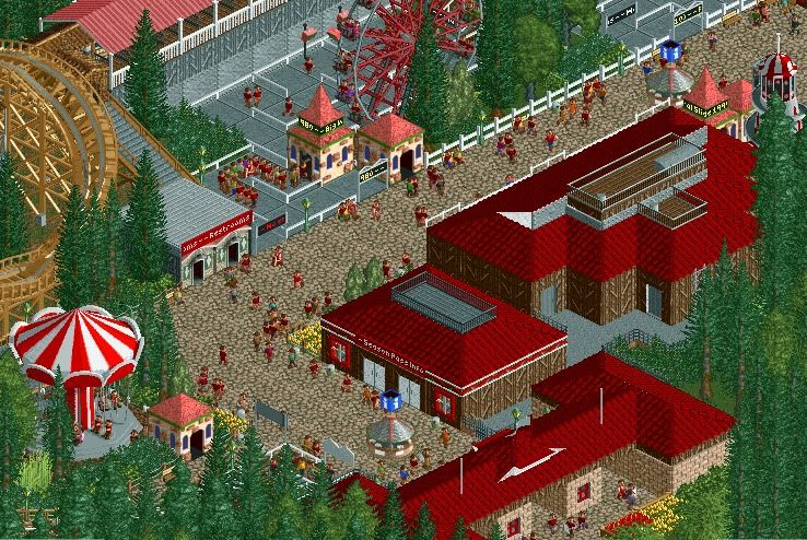
I know my architecture isn't very good, probably my weak point of RCT. But I keep workin' on it. It's defiently an improvement over my past architecture. Any comments/suggestions are always welcome. -

 nin
Offline
From the first screen, I don't like how the trees are just instantly covered in snow, ease the transition a bit.
 Tags
Tags
- No Tags
