(Archive) Advertising District / Dump-Place
-
 19-April 07
-
 LDW
Offline
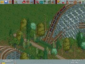
@petrol, the supporting looks okay but I would put more extensive/stronger looking supports on the lift hill. Maybe add a catwalk.
@musicman, looking good so far. I can't really say if it is excellent because I don't play LL.
LDW -

 petrol
Offline
@ LDW i tried what you said about adding more supports or at least strengthen it up. i first added more supports but that just made it ugly..
 there are no horizontal forces in the cable lift so cross bars are unnecessary.. so how exactly can i make it better, any ideae s?
but thanks for the tips
PS: since i used a B&M set is it op if i put [B&M] behind the name of the coaster? -
tdub96 Offline
^B&M is Bolliger and Mabillard, one of the worlds powerhouse coaster designers. If youre going for realism and would say this coaster is built by them, throw it in the name at the end. Its a nice touch so you can say "B&M built this coaster in 2005"
In RCT2, B&M coasters use the track used by Twister/Hyper Twister/Floorless/Stand-UP and Inverted/Flying. And the supports made by Toon that you used are designated to be B&M supports, but you can use these supports for other coasters too.
Hope this helps you understand
-

 K0NG
Offline
@ petrol: B&M's have a rather specific type of supports used on the lifts of their inverted coasters. Check out "El Encierro" by geewhzz&Disneylhand (or any of the myriad other inverted design accolades) to get a better idea of how they're done. Other than that and a few spots that appear to not be connected to the spine, it looks pretty damn good. Particularly for your first try at them
-

 Louis!
Offline
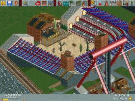
^Apart from the colouring of the blue and red. Yeah it's a nice theatre.
Louis!
Offline
^Apart from the colouring of the blue and red. Yeah it's a nice theatre.@ petrol: B&M's have a rather specific type of supports used on the lifts of their inverted coasters. Check out "El Encierro" by geewhzz&Disneylhand (or any of the myriad other inverted design accolades) to get a better idea of how they're done.
Better to look at the various invert designs, not just El Encierro as B&M have several different ways of supporting their invert lifts. -

 J K
Offline
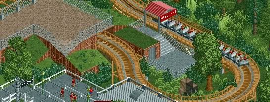
Lovely screens. Both hold a subtle theme park style which I love. Good luck with this buddy and great idea with the chairlift interaction.
 -

tdub96 Offline
@pierrot- Thanks a lot for the comment. You mean the boxes object inside that turn?
@JK- Thank you very much! Its great to reiceve a comment like that from a legend such as yourself
Keep em coming boys! -

tdub96 Offline
Wow, thanks liam
Thanks pierrot. Now that I look at it, it doesnt really fit too well. -

 chorkiel
Offline
for some reason it reminds me of those pre-built coasters in the rct1 parks c:
I like it ! C: -

 gir
Offline
Great theatre musicman. The colors are a bit off, but to some extent the tackiness works.
 -

 dudeism
Offline
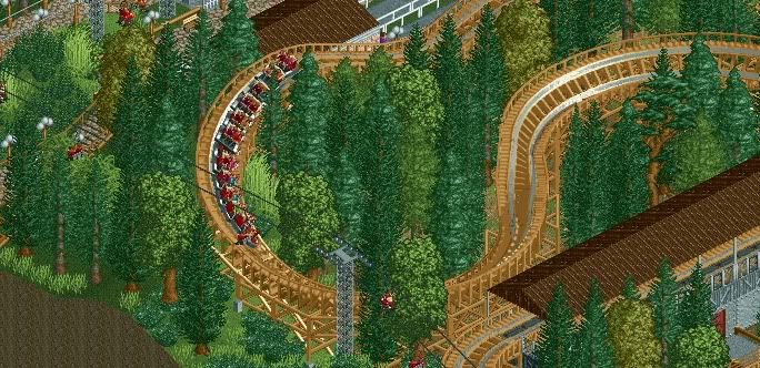
@tdub: That looks great, really like the way the coaster winds its way through the forest. You did a good job on foliage and interaction.
I cannot decide which of those layouts I should use for my park:
#1
or #2 ?
 Tags
Tags
- No Tags
