(Archive) Advertising District / Dump-Place
-
 19-April 07
-

 Casimir
Offline
That screen is ace.
I think with the continued development of a more realistic style in RCT2 ( e.g. all the 1/4 or 1/8 ) objects), an increasing amount of Disney Parks is kind of inevitable. Concerning attention to detail, nothing will ever beat Disney Parks. -
 GigaG
Offline
That is a large amount of beauty in a small space. Try to keep it up for the whole park.
 -

 musicman
Offline
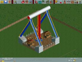
Thanks for the help Liampie, as for your screen, assuming you intend it as advertisement, make the ghost train black and that may be one of my favorite LL screens ever.
 -

 Liampie
Offline
'musicman', on 02 Feb 2011 - 12:54 AM, said:

...as for your screen, assuming you intend it as advertisement, make the ghost train black and that may be one of my favorite LL screens ever.
Actually it's not advertisement... it's a screenshot from this park. Another screen. Thanks, anyway!
-

 StormRunnerFan
Offline
musicman- It's very nice. Right now, my only issue is that the top beam seems to be balancing on top of the blue supports. It it was 5 feet lower I think it would look better, but I'm no LL person.
Now, in honor of my 200th save file for this park, I present The Twilight Zone: Tower of Terror...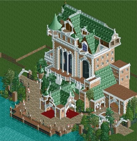
The edges are still in process, but I'm very happy with the way the main building turned out.
Thoughts?
-Storm -

 K0NG
Offline
The majority of the tower looks very nice. But, IMO, the looooooong roof on top just throws everything off...like it's unbalanced or something. Not that it should by any means be symmetrical....but it just seems way too long for the rest of the structure.
 -
 disneylandian192
Offline
Robbie, that screen just oozes with perfection. I love the track use to smooth out the entrance, great yet nearly assumed use of the globe at the entrance. The moon phases are brilliant. I'm just in awe of the epicness of this screen. If you can maintain this level for the entire park, we've got a serious winner on your hands.
SRF, that is a fantastic rendition of Tokyo's TOT. At first I would agree with Cena, but it's starting to grow on me. Love the detail of the building, just not sure how I feel of it being just so close to the water. Changes the atmosphere of the facade just a tad, not sure whether it's for the better or not. I would expect more overgrowth, more of an outdoor queue to immerse the guest into the theme before entering the show building. Right now it looks like the guests just drive right up to the valet. Excellent job on the structure though! -
 petrol
Offline
@SRF. I like the tower in general very much
 . But the right side is (in my opinion) a little dull. Maybe it would look less dull if you made like a dormer on the long roof.
-

 dudeism
Offline
SRF I like how you enclosed that tower by dense foliage and the fence, really adds to the atmosphere.
Here is something I am working on, might start an own topic when i've made a little more progress:


-
 highroll3r
Offline
thats wicked i like the 1st screen. im a bit unsure of the supports on the mine ride tho.
 -

 J K
Offline
All screens look awesome. You remind me off a mixture of Egghead and Steve which is fantastic.
 -

 robbie92
Offline
The details on that last one are fantastic, from the dynamite to the door. You're definitely someone to watch at this point.
 -

 petrol
Offline
hi... this is my first custom support coaster ever.. i did not do the plants and stuff yet.. but i will get to that. let me know what you think

 Tags
Tags
- No Tags

