(Archive) Advertising District / Dump-Place
-
 19-April 07
-

 nin
Offline
Yeah, I agree with the statements above saying how the coaster was a bit out of scale in comparison to the game's. Fix that and it'll look great, Goliath.
 -

 CCI
Offline
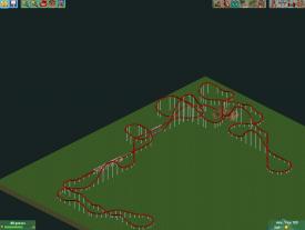
Anyone willing to finish supporting Wildfire pm me please. I just want to get it finished.
 -

 highroll3r
Offline
looks ok wanted but i think you should get some smaller art deco and another texture goin/colour goin.
 -

 K0NG
Offline
jag...you're gettin' there but I really don't like the white spiral slide with the tan castle entrance and red and white canvas over the queue...
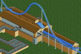
Travis....pick a color, any color, and stick with it on the roof. The blue there just doesn't work, IMO. The whole station is a bit on the boxy side too. Try to give it some character instead of just being square/rectangular. And, maybe try the 1/8 bricks for the columns instead of the 1/4 tile blocks. And spread them out to support the upper part instead of having those girthy columns just on the corners supporting the whole thing. -

 StormRunnerFan
Offline
Wanted:
It looks good, but the color needs some work. More than just brown with the blue added in. I also agree with the comment that the supports are to far apart for the station roof.
Heres something from me...
Unfinished of course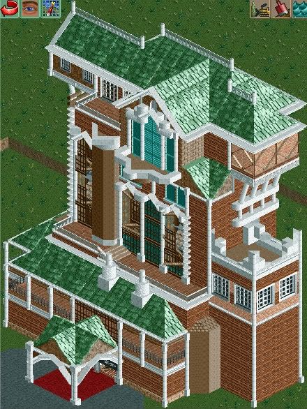
This was originally about 3 times as tall but when I looked at the volcano I created the building was about 100 feet taller. -

 djbrcace1234
Offline
^It's the one located at Tokyo's Disney Sea, or at least it's inspired by that one.
But yeah, It looks great! -

 nin
Offline
The main structure seems a bit on the small side srf, and it has no queue/entry area at all. There's more to the Tower of Terror than just the main structure.
-

 Dotrobot
Offline
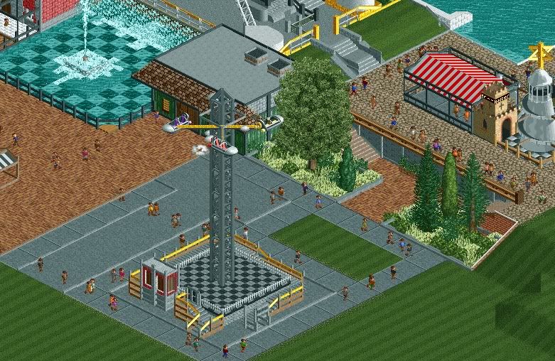
Goliath:I think foliage transition is pretty abrupt at the right side. From tall grass and trees to dead bland ground with short dead grass
Jag: I like it. -

 robbie92
Offline
SRF, nin is right. That's way too small. For ToT, remember that the drop itself is a 13-story drop. Then add in front of it for the structure in front of the tower room for the show scenes. Then, above the shafts, there needs to be plenty room for the mechanisms.
As far as the structure goes, I'd say you have a while to go. It's missing all of the rich details and purpose that the original has. If you are basing it off of TDS's ToT, which seems like you are, the archy is based off of a New York urban mix of gothic, moorish, and mughal styles, which creates intricate alcoves, towers, details, and patterns. At the moment, yours seems slightly generic. This is Disney; take time to add the detail that warrants a Disney park.
 Tags
Tags
- No Tags
