(Archive) Advertising District / Dump-Place
-
 19-April 07
-
 LDW
Offline
@tdub96, thanks I'll try to make it denser without overdoing it. I didn't add too many trees because I was planning on placing buildings behind the track.
@chorkiel, I know, I used zero all clearances but had to tack the top support piece off because it poked through the track. Also, I don't have the special support piece to overcome this in my bench.
@Casimir, I agree I'll definitely add some shrubs to the vicinity.
@highroll3r, I think the size of the footer was the effect of the screen. It was exactly the same as the others. Thanks for the tips on placing shrubs.
LDW -
 Corey
Offline
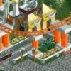
Same area as yesterday. Now everything is yellow, no greens from before. Also wanted your thoughts on the job I did on the bathroom/balloons/hats stands.
-

 LDW
Offline
@Corey, I think you should add a variety of trees instead of just one in different colours. Regarding the stands, I like them but recommend you change the roofs to something more flat. However, I feel the area overall looks much better without that green.
LDW -

 leonidas
Offline
I don't really like the trees standing inbetween the ride that much..
You should really choose wether you want the coaster to stand on a bold area, with no vegetation (maybe some grass and bushes), or in a really forresty invirement.
And when I look at the ground textures I quess you should keep it to low weed 'n stuff,
and keep the trees outide of the coaster area. -

 nin
Offline
I thought it seemed familiarpetrol i like your name ;D

Corey, couldn't you think of something a bit more creative than "Kiddy Land"? I do like the supports however, just seems like there may be too many of them at the moment. -

 petrol
Offline
@goliath: I really like it
 the supports look good. but i think that if you put some small grass ( not to much but pretty bold and not on the sand tiles) i think that would give it a little more natural effect.
  but the coaster is really:
@ turbin: if you read this. are you still in for helping me with coasters??
-

 BelgianGuy
Offline
I agree with Liampie, the coaster is extremely blocky in its turns, I know you're going of by scale but sometimes its better to rescale to the game's propartions for the sake of aesthetics...
 -

 petrol
Offline
hi i am practicing coaster layouts, so plz give your opinion + tips and hints.

Edit: i named him borealis -

 musicman
Offline
looks pretty decent, except for that the riders spend too much time on their backs. This is a pretty common problem to this ride type in rct that always irritates me.
 -

 chorkiel
Offline
first barrel roll/inlinetwist should go to the other side, smoothens it.
same for the second last one, though I'm not 100% about that one.
I don't know how fast it goes into the corkscrews but the part just before the first corkscrew looks like it could be really painfull if it goes fast. -

 petrol
Offline
first barrel roll/inlinetwist should go to the other side, smoothens it.
same for the second last one, though I'm not 100% about that one.
I don't know how fast it goes into the corkscrews but the part just before the first corkscrew looks like it could be really painfull if it goes fast.
it goes 44 mph there, that's 70 kph. the lateral g's are -2.7 g's in different on the turn
seeing that how the human body can take, seeing how it's normal that you can take up to 5-6 G's (so 5-6 times your body weight) i think you are save enougth there
 Tags
Tags
- No Tags

