(Archive) Advertising District / Dump-Place
-
 19-April 07
-

 dr dirt
Offline
Blue definitely might happen, but I'm not going with white. I'll see how blue looks on the chain return, but I'm kinda liking the black.
MA, you bring up a good point, and I totally agree with you now that I think about it. Thanks. -

 Liampie
Offline
I love the black. I love how bright the foliage is. I love the terraces. MA has a point about the grass. And I think those custom trees suck.
 -

 petrol
Offline
@ petrol's first pic:
Am I the only one who noticed the ghost path tiles?
Really nice architecture, though
i dunno but as you can see the park isn't open yet. i open it when benelux area and the mainstreet are done. after that I start with chinees themed swimming paradise. so all the paths that are going no where now are going to be filled with scenery and eventually the paths will al be connected by either bridges or more paths all the paths that lead nowhere when the park is opened are going to be closed by fencing.
-

 John
Offline
Bzz John AC has a yellow catwalk for it mcbr. Id like to see the layout for this
It also has a yellow chain lift that match its yellow supports. Color schemes always match somehow. My point was that gray catwalks and a black chain lift don't really go with a coaster whose color scheme is blue and white. -

 Casimir
Offline
No, I mean the two white path tiles, that obviously ghost glitched. Or is my vision off? oO
 -

 BelgianGuy
Offline
Dirt that's freakin amazing, care to send me a PM with an empty bench of this cuz those trees are exactly what I need for a design I've been struggling with for 2months.
so I ask you PWETTY PWZ -

 petrol
Offline
No, I mean the two white path tiles, that obviously ghost glitched. Or is my vision off? oO
i'm sorry but i really can't find them
-

 chorkiel
Offline
oow die, die heb ik al verwijderd

to bad he's german
@LDW
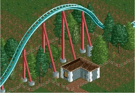
those supports don't seem to touch the track ? -

 Casimir
Offline
chorkiel: Oh, I understood him, you know? ;P It's not THAT far from german.
LDW: It's not too bad. Doesn't look too natural, though. Not enough little shrub-ish things ^^ -

 highroll3r
Offline
LDW the far left support looks odd because the footer is way bigger than the others. try to use some more bushes, ive focused on foilage lately and i use atleast 4 diferent types of shrubery and long grass etc.
 Tags
Tags
- No Tags


