(Archive) Advertising District / Dump-Place
-
 19-April 07
-

 Midnight Aurora
Offline
Rainbows, sunshine, and unicorns. And KONG never said he didn't have AIDS. Just pointing out facts.
 -
 Timothy Cross
Offline
You go, girl!
Yeah, just to clarify, I'm a transsexual. I was born a woman but got the biggest penis implant known to man. It rocks! -

 highroll3r
Offline
hahahahahaha wtf is goin on? bitchfight? coupon i like it. imo remove the bush on the path. it will majorly glitch and like jk said pink all round. that orange fence in the green building would look better a diferent colour. pehaps put a fence all the way around the flat. looks dangerous without one if your going for realisticness. "i think im making up words here hahaha." also try and use a diferent fence on the buildings. they all have that same balcony fence.
 -
 petrol
Offline
@highroller: that the fences are all the same is pretty normal for a western town
but anyhow: i like it. but not a real big van of the yellow building. i think the blue and pink things are to bright for a western theme. especially if the building itself is yellow
(that's what i think) -

 leonidas
Offline
I agree with Petrol..
The yellow is just one step too far.
Also, I don't like the huge industrial box popping out in the back,
but I guess you'll see that in real parks (of less quality) too.
And I'd like to see you add more billboards.
But I like it overall.
-

 Timothy Cross
Offline
^ I'm no coaster expert, but it looks cool to me. I'm thinking the foliage could use some work..
However, I like the elevation changes.
-

 CCI
Offline
I've been working on my project code named "wildfire".
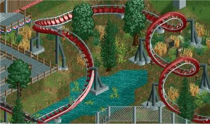
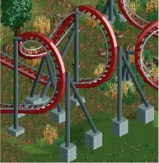
These screens are not final the foliage still needs a lot of work -

 highroll3r
Offline
the only thing i dont like is the blocky footers, the round ones look better imo. every thing els looks good.
 -

 djbrcace1234
Offline
Make sure the footer in the water actually goes in the water. For now, all it is doing is floating, making that support structure worthless. Just use absolute zero clearance to raise the water up when you put the footers in the ground. Also, put some supports on the bottom of the cobra roll because it looks under supported.
 -
 LDW
Offline
@CCI, I agree with HR, round footers will definitely suit better, however I don't like the placement of your foliage, namely the trees after the second corkscrew.
@highroll3r, don't scrap all of it if you have to, I like the building to the far right. Plus the woodie layout reminds me of Texas Giant.
LDW
 Tags
Tags
- No Tags

