(Archive) Advertising District / Dump-Place
-
 19-April 07
-

 Hex
Offline
W_W to me, that looks like a Banshee from Star Craft II IMO. Very nice work W_W and yes I did have an orgasm when I saw that.
 -
 Jaguar
Offline
Walto- It looks fantastic
Musicman- I like it so far, looks very classic
Coasterfreak- I'm looking forward to it -

 nin
Offline
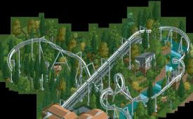
TwistedHelix, color the rapids/waterfall teal entirely, the blue accents kill any chance it has at looking like natural water.
 -

 trav
Offline
Walto, that looks amazing. Twistedhelix, it's a good start, but your landscaping needs work. The foliage looks very nice though!
Alright, might seem a little bit familiar from me, but what colour looks best here?
-

 trav
Offline
It's a different thing Louis! I figured that the park was never gonna be finished so this is just a design.
 -

 nin
Offline
Red. orange doesn't match anything except for the wood on the buildings, which even then it's off colored in comparison.
 -

 musicman
Offline
I vote orange, though I think the brighter more "orangy" shade of of red may actually look best if you haven't already tried it. Of course, I could be wrong.
 -
 Splitvision
Offline
I'm not a big fan of either of them, but if I have to choose one it'd be the red. I'd say play around a bit more with the colours though.
 -

 nin
Offline
That deeper, magenta (used on the pirate roof and flowers) may work well. Gives a strong, supporting color that contrasts against the landscape enough.
 -
 jusmith
Offline
Not orange. Red is ok, but a tad cliche. I am really pulled towards the green, it really adds to the tranquility of the other components.
 -
 highroll3r
Offline
do you guys accept the original supports on the top of the cobra,? or shall i just make custom ones.?
 -

 Splitvision
Offline
^Well it's not a rule, but I see no reason to not have custom supports in that particular place.
 -

 Liampie
Offline
^Well it's not a rule, but I see no reason to not have custom supports in that particular place.
I do... sometimes it's a pain in the ass to do them and they do not always look better.
 Tags
Tags
- No Tags


