(Archive) Advertising District / Dump-Place
-
 19-April 07
-

disneylhand Offline
Hehe, I like the green.
If you're going to change any colors, make them the building ones instead of making your coaster have just another color scheme like all the other one's around.
And I personally don't see anything wrong with building close to the edge..
-disneylhand -

 Ge-Ride
Offline
^It's another one of those "Parkmaking Rules" to keep people from being creative. You can't build any coasters close to the edge of the map, use bright base colors for architecture, need to have atleast one beemer and normal wooden coaster in every full sized solo, have to have a lake in the center of every full sized park...
Ge-Ride
Offline
^It's another one of those "Parkmaking Rules" to keep people from being creative. You can't build any coasters close to the edge of the map, use bright base colors for architecture, need to have atleast one beemer and normal wooden coaster in every full sized solo, have to have a lake in the center of every full sized park...Edited by Ge-Ride, 31 January 2008 - 11:23 AM.
-

 JDP
Offline
^ Ha ha, that's so true.^It's another one of those "Parkmaking Rules" to keep people from being creative. You can't build any coasters close to the edge of the map, use bright base colors for architecture, need to have atleast one beemer and normal wooden coaster in every full sized solo, have to have a lake in the center of every full sized park...
-JDP -
![][ntamin22%s's Photo](https://www.nedesigns.com/uploads/profile/photo-thumb-221.png?_r=1520300638)
 ][ntamin22
Offline
It's how we compare them.
Lakes are for taking up space; beemers and large wooden coasters are what people find and enjoy probably the most in the actual amusement parks they go to, so that is what they emulate. Building near the map edge causes things to look cramped, since they usually have to be wedged in; it eliminates the illusion of a massive land of RCT bliss when you can see the boundaries right next to a main attraction.
logical reasons for everything.
...do threads cap at 50 pages? -

 CedarPoint6
Offline
Or you just extend the scope of your park...Watkins Woods went well beyond what I planned and therefore went off the edge. It happens... I don't see it as such a big deal. Pineapple's looks nice except for the color clash, and ivo's is pretty interesting as well.
 -

 JJ
Offline
Umm no... Cos in the view I have this topic is on page 99.
edit: now it's on 100Edited by JJ, 31 January 2008 - 03:18 PM.
-

 Marshy
Offline
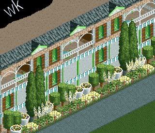
Its a very nice 'natural' colour combination you've got going, as well as a symmettrical(sp?) flower/plant display. I've gotta ask what it is, as it isn't obvious as the moment.
Its not bad, the green deco on the rooves doesn't really suit, so i would get rid of them. -

 Lloyd
Offline
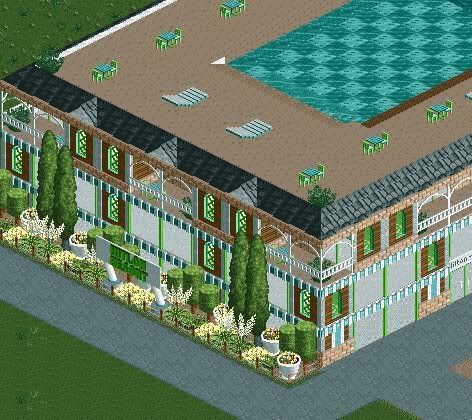
Looks like a hotel to me.
It's pretty nice, but i would swap all the green for another colour. Maybe a gold/yellow, i don't know. -

 woofenskid
Offline
mmmhmm, it's a hotel. this is just the front portion of one wing.
Marshy, thanks. I kind of thought the deco pieces were overkill too, They'll be going away.
Lloyd, I tried a couple different shades, and the green works best. -

FullMetal Offline
Nice hotel, Woof. I personally like the green. I think it looks good. You don't have to take all the deco pieces away, just enough to make it look better. I would like to know what this is leading into though. -

disneylhand Offline
^Hmm, picture someone sitting in one of those chairs around the tables.
Now picture that same person in one of those chaises.
-disneylhand
 Tags
Tags
- No Tags
