(Archive) Advertising District / Dump-Place
-
 19-April 07
-

 JDP
Offline
well someone got their head out of their ass and stopped making awful hotels. keep at it dh
-JDP -

 djbrcace1234
Offline
Your color choices are a bit monotonous-- it's just every building you have, including the flat ride, inherit the same color scheme. Break that up a bit, and you'll have an improved screen there.
-

 Cole
Offline
What else should I change? I have colored flowers, and I changed the flat ride color.
thinking of putting something on the ledge of the biggest building -

 GigaG
Offline
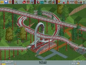
^Its good. Looks like one of those japanese coasters where the whole thing has catwalks. But it is still good.
 -

 musicman
Offline
I am aiming for a "Revolution" style schwarzkopf(sp?) looper. I've seen quite a few Mind Bender/Shockwave style rides and wanted to do something different.
I'm probably going to get rid of the wild mouse under the loop. I had something in mind when I did it, but now looking through rcdb again I appear to be mistaken. I'm also going to lower the (non-lift) catwalks one more clearance most likely -

 Steve
Offline
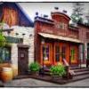
kyle, you are literally too good at this game. those arches look so great and i love how those glass windows turned out.
 -

 gijssie1234
Offline
heey nin, this look verry awsome AGAIN !
but is this a total new park? that will be verry verry nice -

 Austin55
Offline
Use some of those quarter tile grass blocks so there isnt flowers growing out of concrete and brick and it'll be perfect.
 -

 Splitvision
Offline
That't quite pretty, only thing I dislike is the colour of the flowers. I can see a brigher colour work better there. I wouldn't mind some more foliage in general, maybe some floral swags beneath the arches and/or vines climbing here and there.
 -

 nin
Offline
Louis this is all I'm showing, I swear.
Thanks for the comments everyone, things are to change in that screen, maybe I should have mentioned it's unfinished.
 Tags
Tags
- No Tags


