(Archive) Advertising District / Dump-Place
-
 19-April 07
-

 Comet
Offline
Thanks guys
Split: I know what you mean, especially the roof across from the entrance area. I'll definitely be changing at least those
Here's a tiny update since it's probably the last your gonna see of me for a couple of months...
Uploaded with ImageShack.us -

 J K
Offline
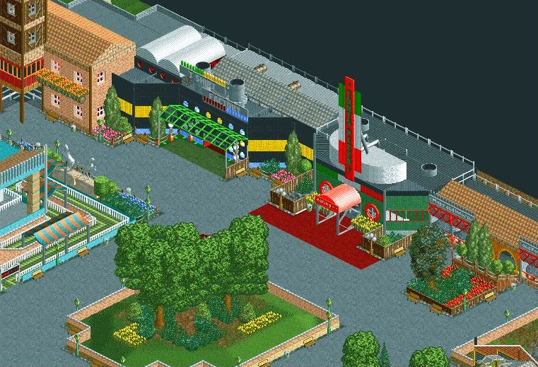
Some of the trees seem to be blocking an area I'd rather see architecture. I know that's a stupid statement but I feel the three trees in the middle could be smaller so I can see past them and through to the glorious archy you're creating.
 -

 trav
Offline
That looks gorgeous Comet.
Picture is from about 6 months ago, but noone has seen any work from me in about 6 months so it's all good! Expect this park in Mid Feb. -

 h3r3stheKrak3n.
Offline
I love that screen legleo. But I think that light building on the right shouldn't be in line with the other one on the left side of it. I Like the path-style a lot!
 -

 Louis!
Offline
Comet, you have improved so much. Fantastic screen.
trav, it's nice, but not as good as I know you can build. -

 J K
Offline
^ I agree, Trav has the ability to be something else but I'm always missing atmosphere from your work. However the market stalls are nice, the coloured roofs work well here and I guarentee you, your landscaping will be near perfect.
Legleo, love it even more now, listen to HTK and you'll be onto a winning screen. -

 SSSammy
Offline
comet: an important thing you need to remember is to keep the eye lines open for peeps. at the moment, the trees in the centre are surplus for any type of function i can think of. the tall trees at the side serve the purpose of framing and leading the eyes towards the architecture/path details, but the ones in the middle only obstruct the field of view. i love how it looks, don't get me wrong, but in the whole composition, i think another tree/feature may be more fitting.
as for the rest of the screen, sexcellent.
Trav: <3 but i agree i think you have some wicked potential.
legleo: i think our styles are very similar! loving the work dude. -
tdub96 Offline
Wow, a bunch of nice screens here. First nice to see comet return, with a very nice screen. And legleo, what a way to debut here, thats fantastic looking. And trav, looks great. Cant wait to see that finished product. -

 J K
Offline
Such a good idea!!! Why could I never think of that? Add some more planters in the bare section of path but it looks good from here.
 -

 h3r3stheKrak3n.
Offline
Casimir and Splitvision I like those screens a lot.
Casimir: Overall it's pretty unusual, the structures, the colors, but it works for me.
Split: Those games are really interesting! Haven't seen that before, at least I don't remember! -

 JDP
Offline
games are great but the support the train is going over seems to be glitchy... if you can fix that your set
..yeah its unfinished, wanna fight about it?
-JDP
 Tags
Tags
- No Tags


