(Archive) Advertising District / Dump-Place
-
 19-April 07
-
 ACEfanatic02
Offline
ACEfanatic02
Offline
No, it should have detailed and less detailed spaces. Equating detail with good and lack of detail with bad is how you get into this mess in the first place.This reminds me of when SA taught me that a park must have good and bad parts to be good overall.
-ACE -
 Cocoa
Offline
I actually think both look great, it depends if you're going more for a main street vibe or more of what liampie said. also I disagree with po6
Cocoa
Offline
I actually think both look great, it depends if you're going more for a main street vibe or more of what liampie said. also I disagree with po6 -
 posix
Offline
posix
Offline
Yes, that, MA, was my point, anyway.No, it should have detailed and less detailed spaces. Equating detail with good and lack of detail with bad is how you get into this mess in the first place.
-ACE -
 Dotrobot
Offline
#2 is more sleek modern and stylish.
Dotrobot
Offline
#2 is more sleek modern and stylish.
No matter how much i love crazy paving. I have to go with #2 -
musicman
Offline
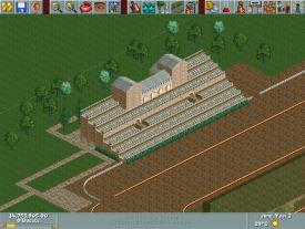
Trying my hand at LL, maybe I'll actually be able to finish (read:start) something.
What do you think?Attached Thumbnails
-
-
 Midnight Aurora
Offline
Regardless, Posix, my point is that there are more ways to direct attention than the level of detail, and that your point, while poignant and relevant in general, has no point being a critique on K0NG's screens.
Midnight Aurora
Offline
Regardless, Posix, my point is that there are more ways to direct attention than the level of detail, and that your point, while poignant and relevant in general, has no point being a critique on K0NG's screens. -
 Austin55
Offline
The station looks neat, albiet colorless, but the layout could be improved somehow maybe, it almost seems to short. If your going for a realistic Scwhartzkopf layout just check some out on RCDB.
Austin55
Offline
The station looks neat, albiet colorless, but the layout could be improved somehow maybe, it almost seems to short. If your going for a realistic Scwhartzkopf layout just check some out on RCDB. -
Louis!
Offline
I take it you are going for DLP's Indiana Jones. It's a bit off, but the basics are there. Still needs work though.
-
posix
Offline
Okay, I see how you understood it.Regardless, Posix, my point is that there are more ways to direct attention than the level of detail, and that your point, while poignant and relevant in general, has no point being a critique on K0NG's screens.
I'm curious about what ways to direct attention you consider important. In a let's-have-a-good-RCT-discussion kind of way. -
 chorkiel
Offline
@John it's funny how only different paths make the screen look from soo different ages.
chorkiel
Offline
@John it's funny how only different paths make the screen look from soo different ages.
The first one looks like it's a screen of a park that's just started.
The second one looks like it's a screen of a really developed park, though it doesn't fit with the caroussel wich means I'd have to go with number 1.
Though I think number one might use another path to keep you awake.
@musicman that looks really nice ! I like the chairs c:
@colorado-fan I don't like that layout.. maybe because of the boring background, or maybe because it's to simple and systematic it could also be the part where it has no theming,
or just the colors.. I like your station though it's a little to blocky and open for a steel I think. -
 StormRunnerFan
Offline
Colorado-fan. I think it need to "blend" in more with the ground, and not in the color way. The ride itself is very much at ground level and lower, so it feels as if the excavation of the ruins is in process already. Just my opinion though.
StormRunnerFan
Offline
Colorado-fan. I think it need to "blend" in more with the ground, and not in the color way. The ride itself is very much at ground level and lower, so it feels as if the excavation of the ruins is in process already. Just my opinion though.
-Storm -
 Comet
Offline
Working my way back into things with a new design...
Comet
Offline
Working my way back into things with a new design...
Uploaded with ImageShack.us
...I feel like I'm playing a whole new game with these objects -
 Splitvision
Offline
I really don't like the mixture of the rusty roof and crazy path. Other than that it looks intersting.
Splitvision
Offline
I really don't like the mixture of the rusty roof and crazy path. Other than that it looks intersting.


Tags
- No Tags