(Archive) Advertising District / Dump-Place
-
 19-April 07
-

 F0ndue
Offline
Is that the original Muskoka Grove?Man,I LOVED it,it was one of my main inspirations for Genfer Gärten.
Merry Christmas and a Happy Holidays, from all of us at Muskoka Grove
-

 SSSammy
Offline
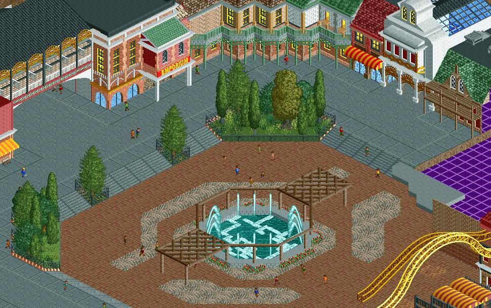
it's nice robbie, but the path layout seems non-sensical at the moment.
srf, i love you. -

 J K
Offline
I've seen better from you being brutally honest, the path textures around the fountain is random, your diagonals need to be worked on and I think you need a core theme to really build something worthwhile.
 -

 BelgianGuy
Offline
can you specify?
I mean I can take criticism and you guys are probably right but can you at least give some pointers instead of its boring? -

 Splitvision
Offline
J K said it all. The green highlights are very, very nice though.
@ Robbie - I love that. Relaxing and very convincing. Have you tried experimenting with the sign colours though? Maybe use something other than green for the letters to break up the surrounding foliage. -

 posix
Offline
I'm sorry BG. Sometimes when so many screens are posted you just post a one liner without thinking.
I think what you have is too open and featureless. What I like is when buildings are designed in such a way that you can immediately understand what they're there for. E.g. a café is often given tables so you look and think "aah, place for people to sit = café!". Another example might be a restroom building where there are two entrances and the building is relatively small. The identification here is not as clear as with the café but it's still giving you some hint at least.
With your buildings, I can't find any identifiers at all and thus I have a problem with it. I only see the "Emporium" sign, which helps some, but it would be much nicer if you gave your buildings more character so that they can be interpreted more easily.
Lastly, I feel the colour combinations don't work harmoniously. I believe you have too many different shades of each colour and in unhappy contrast: red brick, red walls, contrasted with different shades of green roofing and balconies/pillars. I'm also not very keen on how the red path circle in the middle is so clear cut separated from the blue/grey tarmac around it. I prefer it much more if path colour transitions are soft and organic. -

 That Guy
Offline
BG - To add to the other critiques, remove those hostile chain link fences, and turn the other planter fences white. Much more welcoming seeing as this looks like the entrance plaza.
 -

 Austin55
Offline
Yea I have to admit that doesnt look nearly as good as what Im use to from you.
I cant put my finger on what makes it bad exactly but I dont care for any of it to be honrest
-

 nin
Offline
Took a small rct vaca so I figured I needed a little 'test'.
foliage is not finished, btw. -

 Cocoa
Offline
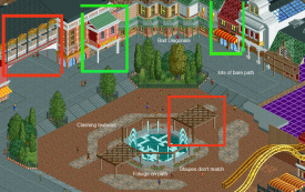
@bg: I think the problem is that there is not specific theme for your architecture. It is just a jumple of different buildings and paths. So I sense a few different ideas: you have some Hollywood style buildings, some NY style buildings, and some Main Street USA style buildings. And also a random building at the left with strange brown awnings. Also the Emporium building sticking out of the New York style building looks strange.
So yah, pick a theme and go with that. I would suggest New York, the best buildings there are the red brick ones, those green balconies, and the broadway style flashy bits.
 Tags
Tags
- No Tags

