(Archive) Advertising District / Dump-Place
-
 19-April 07
-

 Louis!
Offline
At the moment there needs to be more variation of height and colour. At the moment all the bushes/grass is the same height, try varying the bushes a bit. Also it's all the same colour green, try varying this too.
 -
 Evil WME
Offline
Take a look at Space Time Continuum.. and you will find that I had a bit similar thing going on. Might give you an idea!
 -

 pierrot
Offline

I can't understand why u use that pole. it seems to dangerous.
for the rest, really beautiful.
-

 Dotrobot
Offline
K0NG took all that time to do that for fantastico. You must love him a lot K0NG. Christmas joy!
And for the screen.. Idk I just have something against bland ground with dead grass. -
 Timothy Cross
Offline
Turbin - I'd say it's about time you tried out something new. I mean, you have the skill, so maybe try something besides facades with brick columns/arches at the bottom? Even with these similarities, your screen lacks a unified theme imo.
Fantastico - I think you should ditch those premade space capsules and martian things. The foliage doesn't look bad.. maybe ends too abruptly around the rocks tho.
Thanks. I agree with everything except maybe the pre-made objects. Well, the entirety of the vegetation will see a complete overhaul.At the moment there needs to be more variation of height and colour. At the moment all the bushes/grass is the same height, try varying the bushes a bit. Also it's all the same colour green, try varying this too.
Great tips! Thanks Louis, you're awesome.K0NG took all that time to do that for fantastico. You must love him a lot K0NG. Christmas joy!
And for the screen.. Idk I just have something against bland ground with dead grass.
Well, it's supposed to be desert land (see the "Spaceport Omega" topic for more details), but read above and you'll see it's being redone anyways.
Also, yes, K0NG has a FantastiCo fetish. But I hope he ignores this particular line of text because:
1) Actually, he doesn't.
&
2) He's a big scary ape.
*RUNS IN TERROR* -

 Timothy Cross
Offline
Take a look at Space Time Continuum.. and you will find that I had a bit similar thing going on. Might give you an idea!
I forgot to reply to this... you bet!
*Downloading now* -

 Cocoa
Offline
its a bit dull, robbie, but I can handle that if the rest is up to scratch! I love these new trees that have come into style, I've always wanted to use different ones but I felt they would be too unconventional.
 -
 coasterfreak101
Offline
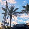
^^That reminds me a lot of one of the entrances to Animal Kingdom's weird prehistoric carnival section. Fantastic dinosaur!
 -

 BelgianGuy
Offline
I agree but nitpicking now if its a brachiosaurus the neck needs to be longer and if its a diplodocus the tail needs to be way longer...
Anyway love the idea -

 nin
Offline
Actually, if he's attempting to accurately portray the AK version, I believe it's missing it's tail? As n it's in the process of being added to the skeleton?
 -

 Phatage
Offline

Merry Christmas and a Happy Holidays, from all of us at Muskoka Grove
I really can't wait to see the larger surrounding area of this screen, already it reminds me of many lakeside parks I've been to but I would have to see a larger screen to see if you fully captured that (or an equally as good) feel. I really like how the rock-tile land is more flat and flowing; you're essentially letting the rock be the texture itself there and it's a refreshing look.
StormRunnerFan, Animal Kingdom?
 Tags
Tags
- No Tags


