(Archive) Advertising District / Dump-Place
-
 19-April 07
-
 gijssie1234
Offline
you have to work on your plants, i don't like the ikea sign, try again and make a different, whit more details.
gijssie1234
Offline
you have to work on your plants, i don't like the ikea sign, try again and make a different, whit more details.
indeed you bus station is funny
and make some other railings -
 Cena
Offline
Cena
Offline
Cena made the slanted ones.
Really? I think I made the diagonal ones as well, but never released them, I need to search threw my objdata folder:) I think I only once showed them on a screen, because I don't build with diagonals often. -
 Liampie
Offline
There's something I don't like about your work, and it was only until recently that I couldn't put my finger on it... I think it's the arcades and the scale. Your arcades are in my opinion always too high and the supporting poles/columns always too thin. They make your buildings look like they're floating. It doesn't really help too that your buildings are usually huge. I don't know why I didn't notice it before, but your buildings are really out of scale.
Liampie
Offline
There's something I don't like about your work, and it was only until recently that I couldn't put my finger on it... I think it's the arcades and the scale. Your arcades are in my opinion always too high and the supporting poles/columns always too thin. They make your buildings look like they're floating. It doesn't really help too that your buildings are usually huge. I don't know why I didn't notice it before, but your buildings are really out of scale.
Apart from that, it's a pretty nice screen. The building on the right is beautiful. -
 nin
Offline
Oh, I like that.
nin
Offline
Oh, I like that.
The supports on the left/center are a bit frail looking, and there's no wall nearby behind it to support the massive building above. I suggest adding walls inside, making a slight interior. For all we know the building could be just an empty warehouse, make it a store or something.
Same goes to the far right, but the supports just don't look good. The ground could also use a transition from dirt to brick? -
 highroll3r
Offline
ye agreed. the supports are anarexic. feed them quick!!!!!! everything els is cool. looks like a nice atmosphere and i like the coulors you use.
highroll3r
Offline
ye agreed. the supports are anarexic. feed them quick!!!!!! everything els is cool. looks like a nice atmosphere and i like the coulors you use. -
 robbie92
Offline
I always feel you build the same buildings, but w/ different textures and, sometimes, color. You gave up on gold, so now let's break away from the brown.
robbie92
Offline
I always feel you build the same buildings, but w/ different textures and, sometimes, color. You gave up on gold, so now let's break away from the brown. -
 Austin55
Offline
I like it, your architecture is always really nice and consistant, but that could be a bad thing based on above comments.
Austin55
Offline
I like it, your architecture is always really nice and consistant, but that could be a bad thing based on above comments. -
Cena
Offline
Yannik, I really can't say I like that screen, it's the same old recipy you have been using over and over again, and it just doesn't taste good anymore (in terms of food speaking). I think you need to quit playing this game for a small period of time, maybe a month, and then restart with a new clear vision, it seems you have become inspiration-less. You have been showing screens like these over and over again, and I am not trying to be a dick here, just trying to help a bit ...
As for the screen, I want you to build something, that doesn't have brown and gold in it, that has more white and color in it, and without the highness of these buildings, I really can't wait for a screen like that.
Hope you can find new inspiration to be creative again, because I really miss your creativity in screens like these.
- Remy. -
 Cocoa
Offline
hey turbin, for once I can actually say I like that screen. the architecture actually seems solid and real, reminiscent of 5dave or robbie. the details are good, although you should drop the awning, get rid of those nasty supports on the red building, and put a base for the tall one (as in no archways.)
Cocoa
Offline
hey turbin, for once I can actually say I like that screen. the architecture actually seems solid and real, reminiscent of 5dave or robbie. the details are good, although you should drop the awning, get rid of those nasty supports on the red building, and put a base for the tall one (as in no archways.) -
 turbin3
Offline
Thanks for all the feedback guys, really appreciated.
turbin3
Offline
Thanks for all the feedback guys, really appreciated.
No Cena, I won't take a break and I won't stop building. -
 Splitvision
Offline
The arcs on the right side are bulky enough, the others too thin. But other than that I would be lying if I said I didn't think the screen looks good, but you should really try to vary yourself more. Do something completely different, not just generic european-looking plazas. You can get too much of everything, no matter how good it is.
Splitvision
Offline
The arcs on the right side are bulky enough, the others too thin. But other than that I would be lying if I said I didn't think the screen looks good, but you should really try to vary yourself more. Do something completely different, not just generic european-looking plazas. You can get too much of everything, no matter how good it is. -
 dr dirt
Offline
Turbin - I'd say it's about time you tried out something new. I mean, you have the skill, so maybe try something besides facades with brick columns/arches at the bottom? Even with these similarities, your screen lacks a unified theme imo.
dr dirt
Offline
Turbin - I'd say it's about time you tried out something new. I mean, you have the skill, so maybe try something besides facades with brick columns/arches at the bottom? Even with these similarities, your screen lacks a unified theme imo.
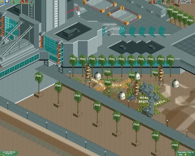
Fantastico - I think you should ditch those premade space capsules and martian things. The foliage doesn't look bad.. maybe ends too abruptly around the rocks tho.


Tags
- No Tags