(Archive) Advertising District / Dump-Place
-
 19-April 07
-

 Gwazi
Offline
i don't think pierrot's screen needs any clutter but it definitely needs something at the bottom to break up the monotony. i think a path change would work wonders.
 -

 pierrot
Offline
wow...I never thought so many replies...
Livefree : I love that station, also sword . but I still think foilage seems to boring.
Splitvision : queuing line location is Great. -

 Austin55
Offline

Going for a proslide tantrum here, any advice? look good? obviously unfinished, focus on the actual funner please
-

 Liampie
Offline
Not sure on the scaling, but otherwise: WOW! I love it, especially the clock! Awesome job!
 -

 Midnight Aurora
Offline
I disagree with everything that has been said. I don't think it's bare because he didn't want to over do it, I think it's bare because it doesn't have any substance to it. Of course, I've been arguing that with Posix about Shuessler's work since 2003-2004, so I doubt he'll start agreeing with me now. Don't clutter it--Just add fucking something to it. It's especially obvious that you're out of ideas since your custom rides are so detailed and your architecture is so empty and lifeless. Keep at it.I make this just for fun, but loving


-
 highroll3r
Offline
thats fucking awsome. love the detail and i think the scale is fine. cant wait to see more.
 -

 Hex
Offline
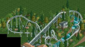
MCI, i love it, especially the atmosphere. The landscape is pretty nice as well. I just don't care much for the tall tree towards the beginning of the lift, where it is all flat.
 -

 pierrot
Offline
sorry Austin
Color is really bad for me and seems too blocky
In addition, path is too thin -

Wicksteed Offline
austin: you shouldn't have bare land behind the glass walls.
i'd say it's a good start, but it seems very unfinished. -
 F0ndue
Offline
MCI,das sieht toll aus,aber mach noch ein paar Überarbeitungen bei den Supports,besonders am ersten Corkscrew.Ansonsten alles Sahneschnitte!Du schaffst es NCSO so gut wie CSO aussehen zu lassen!
 Tags
Tags
- No Tags
