(Archive) Advertising District / Dump-Place
-
 19-April 07
-
 LiveFree
Offline
No problem, Posix.
I guess that is a little large.. it's the same scale as it is on my chest. lol -

 Cena
Offline
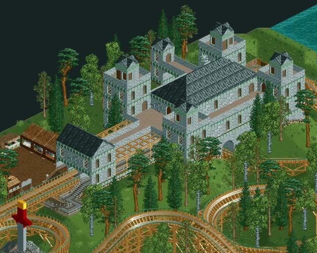
Why is there a door on the tower's top?

Optical Illusion Yannik. It's because of the RCT Isometric View. -

 F0ndue
Offline
I like it so far,but I think it needs something special,like a highlight,maybe a destroyed,burning tower.
 -

 LiveFree
Offline
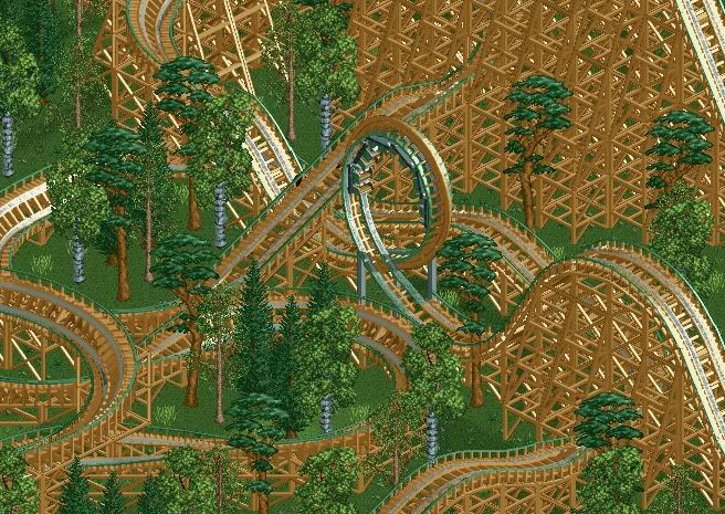
My Camelot area is almost done. Unfortunately, it's the only area even remotely close to being finished. -

 pierrot
Offline
^Foliage needs to change, Not match with woody, IMO
I make this just for fun, but loving

-

 Turtle
Offline
pierrot, i'm SO happy about that, it's really working for me, and i'm glad that you can create atmospheric work as well as mindblowing rides.
people are going to tell you to pile stuff on the paths, like canvas awnings and barrels, but please don't, I really like the sparseness at the moment. maybe elsewhere in the area, but leave parts like this bare, or the detail loses its effect. -

 SSSammy
Offline
i find that perfect, perriot. maybe a different path texture could be integrated towards the bottom of the screen, as the only problem i can find is the blandness at the bottom.
 -

 tdub96
Offline
I'm with JDP. But maybe its a LL thing that I just havent figured out yet. Your rides and ideas are sick, and i'd love to see that translated to a park, but this isnt up to how talented you are imo. Again, I'm probly missing the whole LL thing.
 -

 Splitvision
Offline
Yeah I can't see what's so great about it either TBH, though I'm seldom very impressed with LL screens overall so that doesn't mean much.
 -

 Louis!
Offline
people are going to tell you to pile stuff on the paths, like canvas awnings and barrels,
are we?
i think it looks great as it is, the path could do with being broken up a bit, but not by piling stuff onto them.
anyhoo, it is a much better attempt than your last buildings, it has less dependence on the codex, which makes it much more charming.
great work. -

 Turtle
Offline
are we?i think it looks great as it is, the path could do with being broken up a bit, but not by piling stuff onto them.anyhoo, it is a much better attempt than your last buildings, it has less dependence on the codex, which makes it much more charming.great work.
i thought people would, mainly because i almost did it myself.
i immediately thought "that area needs barrels, and more clutter." then i wondered why for me, clutter = atmosphere. i decided that it gives the area a little identity, and a purpose. then i decided that this particular area didn't need it, because the sparsity is actually quite imposing, and i like the blankness of the walls. it isn't necessarily how i would do it, but then, i don't want to see work like my own all over the place.
 Tags
Tags
- No Tags


