(Archive) Advertising District / Dump-Place
-
 19-April 07
-

 Splitvision
Offline
^^ From the interactive map from Liseberg.se on which I base much:
I'm not sure yet wether or not I'll put the ship in, I feel it might get too cramped. -

 SSSammy
Offline
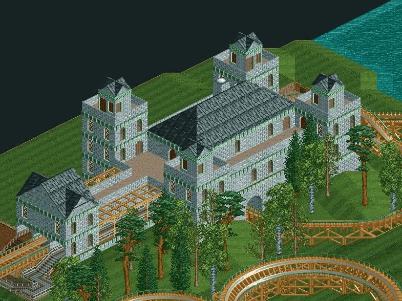
it's not correctly proportioned, split. and there are more sophisticated ways of doing those window. right now it looks childish.
 -

 LiveFree
Offline
okay. now that i look at that again, the roof on the far left needs some serious overhaul.
 -

 That Guy
Offline
I actually like that a lot. One suggestion I will make is when using the backside of the steep roof,
color the roof part grey so it blends a little better.
edit: nevermind, guess you already noticed. -

 Dimi
Offline
Faas: the colours are clashing terribly, especially on the path, but the structure is very nice. I wouldn't lower the queue below the brake section.
 -

 LiveFree
Offline
Hmm,this reminds me of something...
There may have been some inspiration from another person on this site...

-

 Splitvision
Offline
@sammy - I'm well aware of the faults in terms of proportions. Call me lazy, but it's too late for me to change that now. The way I see it though is that that is just the level of imperfectness I'm happy with. I'll see what I can do about the windows, although I do think it looks fine as it is, albeit maybe not exacly as it does in real life. I've already stated that I won't be fanatic a la Kumba in terms of accuracy.
 -

 SSSammy
Offline
there's a fairly hefty difference between accuracy and aesthetics, and yours seems to constitute neither. i'll hold judgement on the entire work, of course.
 -

 LiveFree
Offline
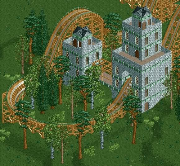
it leads to the outside? You just can't tell, 'cause there's a wall around the outside.Why is there a door on the tower's top?

-

 posix
Offline
LiveFree, I think it looks solid. What I find very problematic though is what your signature looks like. It's way too big and intrusive. Could you make it like 4x smaller perhaps?
 -

 Splitvision
Offline
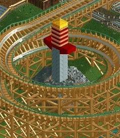
I think it looks nice, albeit maybe a little repetitive, try some detailing in places. The sword is neat, though maybe you should try to make the blade slimmer so that it has more of an edge.
 -

 Liampie
Offline
http://i786.photobuc...hotos/SCR13.jpg
I like classic LL, I love natelox and I love you, but I'm not a huge fan of forced natelox inspirations. You can do more interesting stuff with LL, I know. Moreover, I've seen so many entrances by you and so little parks. Is this a serious start of a park or just randomly fooling around? In the latter case, I suggest squeezing all the shit into one map so there's actually a change of it getting finished, even though it's a map full of random unrelated shit.
 Tags
Tags
- No Tags


