(Archive) Advertising District / Dump-Place
-
 19-April 07
-

 Hex
Offline
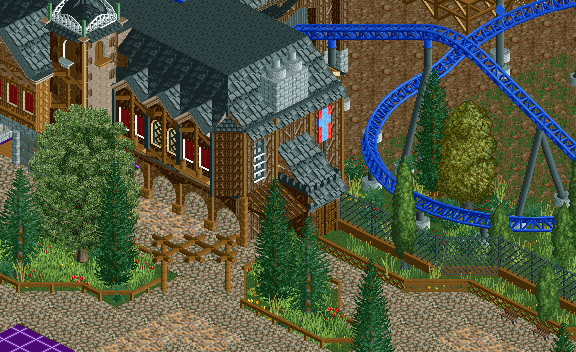
MCI, I just love that screen. You can just feel the atmosphere. Great work and good luck with the rest of that invert.
 -

 Gwazi
Offline
i leave for a few months and Maverix improves exponentially. that said i agree with Louis that your buildings are a bit too blocky.
P.S. Louis = design whore? haha damn man good stuff. are those last couple from the park you wanted me to work on a long time ago that i never got around to? they look quite familiar. -

 Louis!
Offline
^nah, only Viper is from that park. I was gonna release another one from there, but I decided against it.
 -

 Gwazi
Offline
gotcha. Volcanis appears pretty similar to one of the areas, so that's why i thought that might have been too. good stuff though, you have the most designs of any one member now, right?
 -

 posix
Offline
Maverix, I like it a lot because the path level is elevated from the coaster's low level.
 -

 Louis!
Offline
^the united kingdom misses you already
Louis!
Offline
^the united kingdom misses you alreadygotcha. Volcanis appears pretty similar to one of the areas, so that's why i thought that might have been too. good stuff though, you have the most designs of any one member now, right?
Yeh, I guess it is a little similar, and no, Roomie has 9. -

 F0ndue
Offline
...and obviously awesome!
Blue Fire inspiration?
Edit:Spied a Depot tree,one of my fav objects!Keep it up,dude! -

 BelgianGuy
Offline
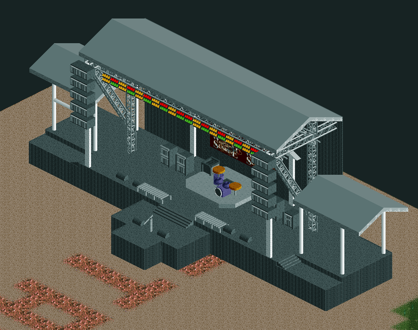
ok I know its extremely unfinished but I'd like some thoughts on the structure...
-

 J K
Offline
The festival screen is awesome but your one before that I don't like at all. It just looks busy and uninspired.
 -

 Austin55
Offline
Dude That's awesome Belgianguy. I would love to see if you could make it "functional" somehow.
Edit-Looking again I agree with posix, the roof is very bare and textureless, maybe if its a permenant structure try the Kumba Roof, or even try to use those canopy type canvas things. I also think you could add more detail to the speekers somehow.
 Tags
Tags
- No Tags


