(Archive) Advertising District / Dump-Place
-
 19-April 07
-

 Louis!
Offline
As I said earlier, it is incredibly skillful, but I still think it looks messy and unorganised. I think the same effect/idea could be produced clearer, cleaner and with less trackitecture.
By all means, keep it as it is it's your work, I'm just trying to nit-pick things for you to maybe improve on, instead of just sitting back and singing your praises like most do.
-

 Phatage
Offline
I don't think you captured Gehry actually. You definitely captured the right proportions and general layout, but it looks too organized and not as organic as his work or even Natelox's Gehry-inspired work. Thing is, I actually prefer something like what you did over something more true to Gehry because I generally don't like his work (but I do like his Dancing House in Prague because of how the building transitions from its surrounding context to a both literal and figurative twist), but if your mission was to emulate his work, I think there's a good amount of room for improvement.
 -

 Midnight Aurora
Offline
Actually, Natelox got a bit pretentious about it and took the "Well I didn't expect you to get it..." approach.I knew this would get a response like this. If architecture students, architects, or those just interested in architecture recognized it pretty quickly, than my goal was made. Just because one person can't discern the purpose quickly doesn't mean others can't as well, especially others with a much deeper involvement in the subject at hand. I assume Natelox had issues with this when he started doing Gehry-style work in LL, but I achieved my goal with this, so I'll just need to respectfully disagree with some people.
-

 Maverix
Offline
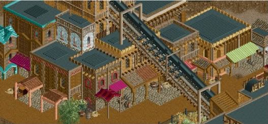
Slightly unfinished in the corners (and yes there is a piece of path missing, that's been taken care of)
-

 Austin55
Offline
I don't like that Austin, looks like you're taking a step back skill-wise.
Not to sound defensive, but mind explaining why? Im interested to know why you think this. -

 Liampie
Offline
Nice work Maverix, but with such excessive theming you might theme the roofs as well. Would make it more interesting anyway.
 -

 BelgianGuy
Offline
Also the fact peeps WILL see the rooves aswell when they head up the lift makes it a must to do so.
 -

 J K
Offline
I love it but why oh why did you use that roof to the very left? You're seriously getting so good and you're doing exactly the right thing in building your skill with designs. When you're fully developed with your building style then move onto bigger things, it's a very smart thing to do and I wish more new players would do this so they didn't spend all their time stuck in the same style. New players should experiment with as many new themes as they can and you're doing just that. I'm impressed to say the least.
 -

 posix
Offline
Looks good Maverix, but the attention to theming others have brought up is a valid point I feel. I'd like to stress BG's point though that theming should be where viewable, and where not too expensive to the fictional park budget you're managing. So depending on how much money you want them to have, theme the roves or don't theme them. Generally, I would say don't theme them as it's more realistic since too few parks do this.
What I find more problematic though and would thus like to point your attention to, is that it feels as though the lift hill pierces through the buildings as there is no dedicated space for it. I question your intention to design the lifthill like that. How did it come to? -

 Maverix
Offline
Liampie, BG: The roofs will/ have been taken care of
JK: I assume you mean the turquoise roof? I used it because I thought it helped break up the repetitiveness of the area as I thought I kept using the same roofs over and over again. Do you have a suggestion as for what to do instead? Because I really like how it looks personally.
Posix: I actually did want it to feel like the there seemed to be no real space for the lift. My goal for it was to make it seem like the coaster revolved around the village and not vice versa because I personally think it looks better.
As always thanks for the comments, hopefully this will have it's own topic soon
-

 Liampie
Offline
JK: I assume you mean the turquoise roof? I used it because I thought it helped break up the repetitiveness of the area as I thought I kept using the same roofs over and over again. Do you have a suggestion as for what to do instead? Because I really like how it looks personally.
In this setting, steep tiled roofs like this are 95% of the time not done, in my opinion. It just doesn't make sense. Moreover, why blue? Of all the colours you could pick, you picked colour that's probably the least frequent in natural resources. Natural resources are the most logical building material in such a theme, I think; mud, stone and wood are the basic ingredients. Blue is rare!
Instead you might try a flat roof with a tent or wooden canopy. If you do it right a dome might work, too...
Also, I noticed a lot of your theming is plastic: too perfect to be credible, too little controlled imperfection to create a strong atmosphere with identity. In other words, replace some of your smooth walls by crumbling ones, plaster peeling off revealing bricks or (in this case more logical) stones, a building with doors and windows boarded up. Don't use such details too often, because they're meant to break the repetitiveness and fill the gaps between rides and restaurants that would be otherwise void of anything interesting. -

 JDP
Offline
Just sent her in...
Roller Coaster: Diablo
Classification: Roller Coaster
Type: Steel - Inverted
Make / Model: Bolliger & Mabillard / Inverted Coaster / Custom
Designer: Ing.-Büro Stengel GmbH
Height: 103'
Drop: 113'
Inversions: 6
Speed: 65 mph
Duration: 2:55
Elements: Loop
Zero-G Roll
Immelmann
Batwing
Corkscrew
Trains: 2 trains with 8 cars per train. Riders are arranged 4 across in a single row for a total of 32 riders per train.
Theme: Is themed to an old tale of pirates who took over a Mexican village by force, murdering innocent people. While living in the village the grounds became cursed inviting the devil who chased down the murdering thief's. The pirates went to the town church where they went to be protected from god--little did they know god let the devil in to retrieve their souls.
-JDP
 Tags
Tags
- No Tags
