(Archive) Advertising District / Dump-Place
-
 19-April 07
-

 tdub96
Offline
I neglected to mention that this is based off a combination of Prowler and El Toro (Plohn). I didnt really want it to be as compact as a normal GCI because the sections in the lower right of the screen are to be runs through the forest.
Thanks for the comment! I'll see if i can add some more whipping turnarounds. Thanks liam -

 That Guy
Offline
Prowler being at my homepark, I'm not feeling it. That long straight section by the station, the first turn. Everything just seems to be going the opposite direction then it should be.
 -

 SSSammy
Offline
that's not a great layout to be honest. i don't see any likenesses to any gci :/ if you could show me some pics that you took ispiration from, or any sources really, maybe we can improve the flow and aesthetics.
 -

 tdub96
Offline
@TG-its not supposed to be exactly like Prowler, just the dash through the forested area was inspired by that part from Prowler. Thanks, I'll try to improve this.
@SSSam-I took inspiration from Prowler's pov as well as El Toros, using some pics of Thunderhead too. What specifically lacks flow in this layout?
Thanks guys, I'll keep workin on it. -

 Louis!
Offline
El Toro is compact though lol
The station fly-by seems really forced too, which makes the layout lack even more flow than it already does. -

 tdub96
Offline
Alright, I worked on it for the past half our or so and I've got a layout I like better than the old one, hope you guys too.
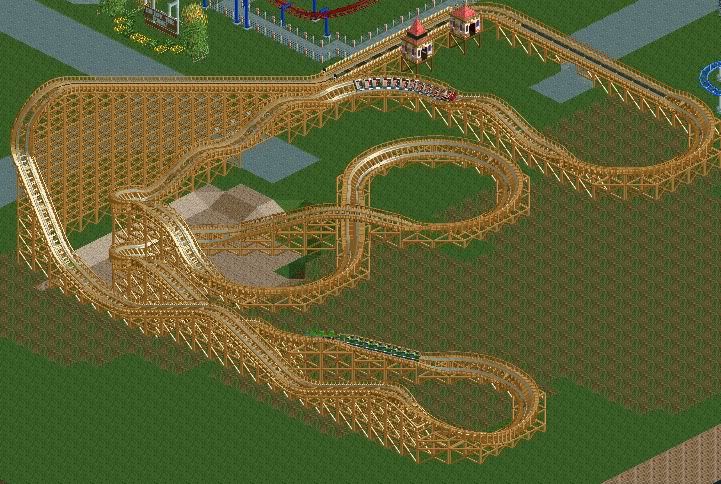
Please comment!
Thanks -

 Splitvision
Offline
I like that alot more, but it would maybe look even better if you put a larger drop in place for some of the smaller ones, right now it looks a little flat.
 -

 pierrot
Offline
hi guys
I found a interesting old picture from zenosbleed
Park name is 'Caramba World'
enjoy it

-

 tdub96
Offline
Wow, nice screen there.
Thanks split! Anyone else have thoughts on the new layout? Thanks -
 Jaguar
Offline
I don't know how to make it that way, and I have tried many times, how do you remove the entrance huts?
 -

 BelgianGuy
Offline
Geewhzz hack or white glitch em, I reckon gee method cuz white glitch gets hairy and gives ET when you try to demo it so be aware
 Tags
Tags
- No Tags


