(Archive) Advertising District / Dump-Place
-
 19-April 07
-

 disneylandian192
Offline
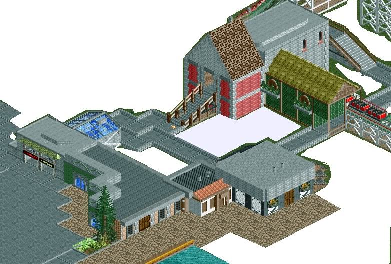
Probably my favorite bit of foliage I've done to date. This project is proving to be quite fun and is moving at a respectable pace (at least for me).
PS: yes I see the missing deco pieces -

 Dotrobot
Offline
Problem will be fixed
 glad you like the foliage. I'll try to stay away from the red and yellow flowers some as well.
Info Kiosk is gone too!
Thanks for the feedback. -

 disneylandian192
Offline
Jag, it's a good start for sure. I would be wary of posting screens onto the ad district before they are ready. One easy way of knowing this is if you feel you have to white out incomplete sections right in the middle of the screen. It's generally assumed a posted screen is of a portion of a project that has been created, worked, and reworked and is finished enough to start getting opinions from the community at large. Ask yourself before posting, "Is this area beyond any more major revisions?", "Am I happy with this area?". Keep this in mind and you'll be surprised by how much more constructive and specific people's feedback is, which helps immensely.
 -

 J K
Offline
Sorry Jag I can't comment on the first screen, it's just lazy in my opinion, bare grass is actually really aesthetically pleasing. I just can't understand why you wouldn't complete a screen rather than chop it up like this?
 -

 Dotrobot
Offline
Well disneylandian. He might've just wanted comments on the supporting and whether to ask our opinions as it should good or not. But that's just my thought.
Jag it looks nice but now I can see your archy is lacking.
You're using stuff that people normally don't use. COPY A BIT IF YOU HAVE TO. Your structures are also too short. Don't be afraid to make bigger structures that are not ride related. -
 Jaguar
Offline
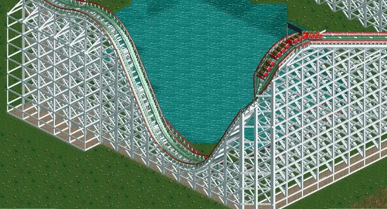
Well, I don't post fully finished screens that often, because it is easy to modify something when I have just started. I also wanted to hear something about those supports, as the actual ones in RCT are wrong.
 -

 That Guy
Offline
No point in making custom woody supports unless it's a hybrid...and even then...
It's good to see you're trying an easier theme, your buildings look much nicer. -

 Liampie
Offline
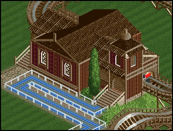
Remember what I told you about brown?
I think the shape is nice, but it desperately needs some colour. -

 Liampie
Offline
Haha! I spoke to Geert on msn yesterday and we talked about colours, he said that he thought his work was too brown himself.
-

 Faas
Online
Well the brown is fine as it is right now, just make sure you don't continue that way so it isn't all brown. Colour your environment more.
 -

 tdub96
Offline
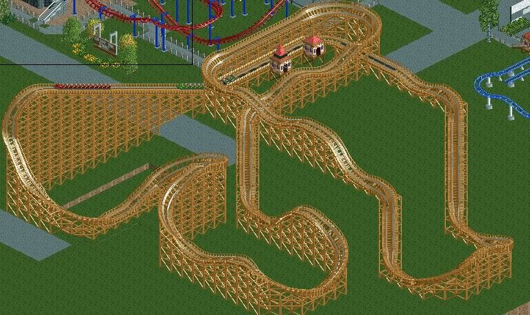
Unfinished screen, but I'm hoping you guys like the layout so I can do some more stuff to finish this. Its a GCI woody, any thoughts on this layout?
Thanks,
Taylor
 Tags
Tags
- No Tags

