(Archive) Advertising District / Dump-Place
-
 19-April 07
-

 Casimir
Offline
It was a Fiesta screen, not TOO long ago ;P
Thanks for bringing it over, Cena! =)
And thank you very much for that comparison, that's actually like an ennoblement to me! -

 F0ndue
Offline
It looks really nice,you really catched the charme of switzerland a daves building style as well!BTW,I was searching for these brick corner wall things,but I can`t find em,could you upload them please?Since I want to fresh up my archy in my current project I want to build chalets similar to yours.Oh and what do you use for the white walls?
 -

 BelgianGuy
Offline
Coupon I'd like to see you build something else than SF or in that particular style, we all know you can do that now try something new to actually wow us with your own imagination and themes, its getting repetitive sorry...
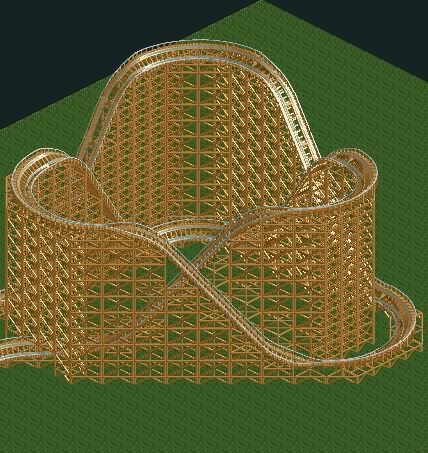
LiveFree, that looks massive but I hope the pacing is good on an element like that because it looks as if the last few turns will be painfully slow on the top parts. I can be wrong though, I'd like to see more of this -

 Louis!
Offline
Coupon, thats really cute again. So simple and clean, I love it. Gorgeous colours too.
 -

 Cena
Offline

From my new park...
DON'T PUT DECO TRIMS ON EVERY BUILDING!
But other then that, the screen is fabulous !
!
-

 Cena
Offline
Why not, may I ask?
It doesn't look good on each building, it looks inspiration-less and you are killing your object limit with it. -

 djbrcace1234
Offline
Again, Coupon,I love the overall composure of this screen, but I still think your buildings are small in peep scale in my mind. However, I am not talking about the height per say, but I'm talking about the overal depth of the buildings. They just seem, small to be functional eatires, stores, bathroom areas etc.
But for what is there for now, it does have a charming look--much like a family park would look like. All the colors add more depth to the buildings, and the cleansiness like others have mention is a major plus to any good atmosphereic park. -

 Dotrobot
Offline
Yeah, that's what i think too djbr. But you've messed up on a lot of trees colors. The black poplar tree (i believe) should be a dark green. It would look better that way. Gives the foliage a diversion from all that same style of green.
But I do agree to some extent with Cena. Using that deco trim on EVERY building gets boring. There is a more diversion in your details now but try some more different details. -

 ACEfanatic02
Offline
Sorry, Coupon, but I really don't think this is a well-thought out area. Let's look at it from a guest's point of view:
You come in under a (very nice) entrance gate. Directly left of you is a row of small shacks, while right is just woods. Not far ahead are a few more shacks and a sharp turn. Sure, this isn't out of the question for a small family park, but as a guest I'd be pretty underwhelmed. There's no grandeur -- and even tiny, crappy parks in real life at least try.
And then we've got a carousel, shoved in a corner. Carousels (and swingers) are centerpieces. They just don't work well shoved in a corner. The need path at least 3/4 of the way round, 'cause half the fun of a carousel ride is watching the people on the path as you go around.
-ACE -

 Dotrobot
Offline
2 Very unfinished screens from me. The white and brown building you see is deleted. New park. No name or location as of yet. But it will not be a generic brand park.

-

 RamSam12
Offline
I don't approve of the randomly undecorated info kiosk in the path which looks a bit out of place, but this is most definitely a great start otherwise.
 -

 Louis!
Offline
Shame about the random info booth, however I love how the turnstiles have been done, and generally its a good screen. The foliage is also really nice, perhaps you shouldn't use red and yellow flowers all the time though.
 Tags
Tags
- No Tags


