(Archive) Advertising District / Dump-Place
-
 19-April 07
-

 Goliath123
Offline
Posix the monorail was used on the lenox mall carpark too, that was when i saw it first anyway.
Split and SRF: Looking good guys! -

 Maverix
Offline
disneylhand please finish that, and I hope the park has lived up to its potential.
A bit more updated version of a fiesta screen: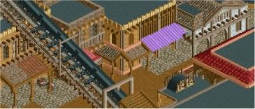
-

 Fizzix
Offline
I really like your work, Maverix. I just don't understand why there's some purple right in the middle.
-

 Cocoa
Offline
srf, if you fill that park up with actual things from Futurama and all of their silly jokes I will be the happiest man ever.
 -

 Splitvision
Offline
Yeah i'll admit i got some inspiration from fr3ak
 but honestly that is the best way to make rounded walls look good. If you use map object manipulation , which i believe fr3ak did,, you can make it look even better by having another "layer" of track in between.
-

 Fr3ak
Offline
Yeah i'll admit i got some inspiration from fr3ak
 but honestly that is the best way to make rounded walls look good. If you use map object manipulation , which i believe fr3ak did,, you can make it look even better by having another "layer" of track in between.
Yeah you do pretty much have a nearly flat surface. -

 Chillsons
Offline

Thought I'd have alittle post.
Need to finish the park area, supports and the water. -

 J K
Offline
You're certainly getting there with your architecture and I like what you've done with the roof to make the structure a lot more interesting to look at. It also has a purpose now which is excellent. Near the playground add some tables and chairs for an eatery and you'll start to build a really nice amusement park atmosphere. Also, give us something more stimulating to look at, I'd say delete one or two different blocks from the structure randomly and add another texture in there. It'll add something nice to it, if done right
Foliage is looking great, maybe quite a bit more around the waters edge and coloured flowers for the guests near the paths. -

 nin
Offline
Hmm, maybe ease the transition between the border and the water, it's too abrupt at the moment.
 -
 GigaG
Offline
Good, but put some guide rails on the splash boats "free float" segment before the drop.
 -
 disneylandian192
Offline
Hmm, maybe ease the transition between the border and the water, it's too abrupt at the moment.
I wanted the boats to come close to the walkway, I'm working on reworking the scenery to soften that transition. -

 djbrcace1234
Offline
I agree with Nin. I understand you want a close encounter, but wouldn't some of those rocks disrupt the viewing of the ride? Maybe even if you raise the land where the foliage is will help break the abrupt look that it currently has.
But to comment on what is there: I love what you have going on here. -

 Cena
Offline
Hello 5Dave
This is just an awesome screen Casimir! It looks a lot like 5Dave his building style, and that is a very big compliment you can get from me, I really like it.
 Tags
Tags
- No Tags


