(Archive) Advertising District / Dump-Place
-
 19-April 07
-

 Louis!
Offline
The building on the left seems very flat due to the flat roof and flat wall with no awnings or 1/4 tile parts sticking out. But that is the only major thing I see here, and its not major, its minor.
I do think though that all these new objects by Kumba, mainly these roofs, are being way overused by everyone to the point that everything looks similar now. But oh well.
Anyhoo, really nice screen from this project again. -

 RRP
Offline
i think they're being overused louis because people have wanted a corrugated roof for ages and now they final have one so don't have to compromise
 -

 Louis!
Offline
^oh yeah, i know and totally understand the reasoning behind using it, but it is majorly annoying to see the same object being used so frequently throughout the ad district. but then i spose its the same as any other roof type being used a lot.
 -
 F0ndue
Offline
Belgian Guy,thats classy,but I`m not sure about the building at the left,also the are looks not zuluish enough,but thats only my opinion.
 -

 J K
Offline
More and more roofs will become available, thats the amazing thing with new objects. Argh I can't wait to see more made as good as this one.
 -
 LiveFree
Offline
First thing I've worked on in over two years. It's nothing special, but I'm proud of it. It's in a park called Elkhorn Lakes. I call it Skyline.
Here's the station: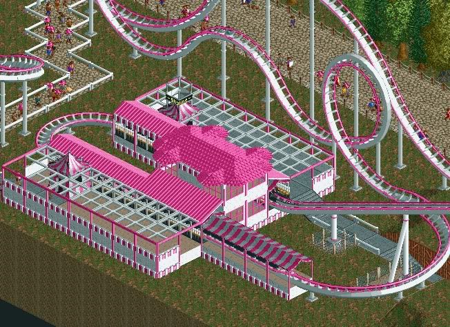
and the layout: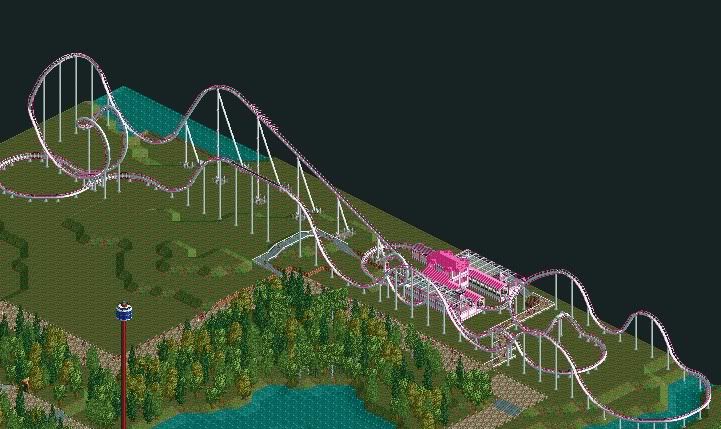
Like I said, nothing special, and it needs lots of work. But I wanted some feedback before I continued. -

 StormRunnerFan
Offline
LiveFree... I'm a little confused about... a bit of that. Interesting layout though I'm not really liking the hill after the lift. It just seems strange, but hey. This is how I started out. I hope to see some more work from you.
Now...
"To the flying machine!"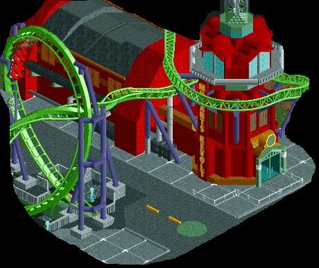
-Storm -

 Austin55
Offline
looking for tips to improve my BTR. Mostly on theming, I know the supports need work.

-
 twister12
Offline
hey austin. i know im not a regular poster, and dont have much experience on rct2, but i think you should use the brighter yellow for the track. even though it is supposed to be a dark theme, most real batman clones that use yellow are pretty bright.
http://www.rcdb.com/1365.htm?p=28643
http://www.rcdb.com/32.htm?p=10707
http://www.rcdb.com/552.htm?p=27784
also, i dont know if i like the dry grass. i really like the look of the foliage at the top of the 1st screen though. hope this helps! -

 Louis!
Offline
It's lacking details. I know it's industrial factory etc, but it's missing little details here and there that make the building interesing. At the moment its a bit like a steel box.
 -

 BelgianGuy
Offline
Cars, signs, a big skylight would be awesome aswell, things that scream batman would do the trick I think.
 -

 djbrcace1234
Offline
Well, while we are discussing Batman themes, how is this?
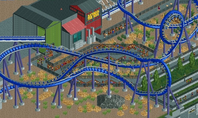
Edit: Austin, I feel as though it is too 'clean' for the industrial look as well. Maybe more over growth can help with this look. -

 Cena
Offline
A bit rough, but still very pleasant for the eye. Your foliage needs some more attention though! Good luck.
 Tags
Tags
- No Tags

