(Archive) Advertising District / Dump-Place
-
 19-April 07
-

 Louis!
Offline
Austin, I see it now so:
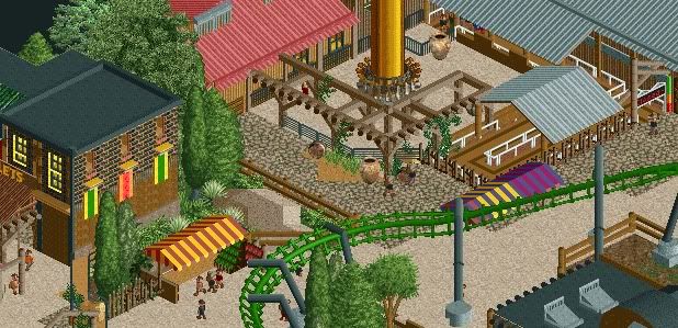
The wooden catwalk looks odd as that colour. Recolour it to the track colour, it's connected to that so in real-life it would be painted that same colour as the track, plus aesthetically it would look nicer.
Support work looks good, needs supports on the loop, but I guess you havent gotten round to that yet. I think the umbrella colours work well against the track colour too, I wouldnt change that, I love that raised seating area though, really nice and perfect location.
The building however is odd. The textures are off. You have wood, then lattice, then the mud style in the roof. Also the roofs change from shingle/tiles to wood. Again a bit odd. Simple way to fix this, change the shingle roof to the steep wood roof. It would also be realistic this way too.
But great stuff. -

 Austin55
Offline
The way I see it is it would be alot easier to have bright umbrelles than to paint a rollercoaster, it makes sense to me that way.
Catwalk ladder added, here's the other view.
-

 Dotrobot
Offline
Maybe brighten the umbrellas with white? I've never been fan of that umbrella though. It's better to use the curved corner tiled roofing.. For me.
 -

 In:Cities
Offline
the colors are too random for my taste.
not a fan of the green building with the red, white and blue flag stuff on it either. looks strange. -

 K0NG
Offline
^Agreed...that olive green doesn't work for me on an entrance area. Try a more 'welcoming' color. And the purple/white/aqua building....just, no. But that screen isn't altogether terrible. A bit of tweaking and you might have something.
 -

 Dotrobot
Offline
Sorry. I wasn't exactly.. Inspired today. And a suggestion for color change? I'll try dark mine brown.
 -

 pierrot
Offline
oh sorry , my mistake...what? i haven't shown a screen o.o. this was directed towards jag i believe.

how about 'green building' -> beige wall & black roof ?
I think It makes more gorgeous.
------
Austin55 : I think 'right side small road' needs more touch -

 Louis!
Offline
Austin, I still think you would be better off with the catwalk changed to the red rather than the turquoise.
Also i agree with the others on the fencing, maybe use the brown wooden fence throughout, but for the queue lines change its colour to grey or red, then you get the blend and consistency of the fence, but with variety because of the colour change. -

 BelgianGuy
Offline
New For 2013 at Busch Gardens Tampa, Fear the Lightning and the height in the new ZULU area...
let the beast loose.
 Tags
Tags
- No Tags


