(Archive) Advertising District / Dump-Place
-
 19-April 07
-
 disneylandian192
Offline
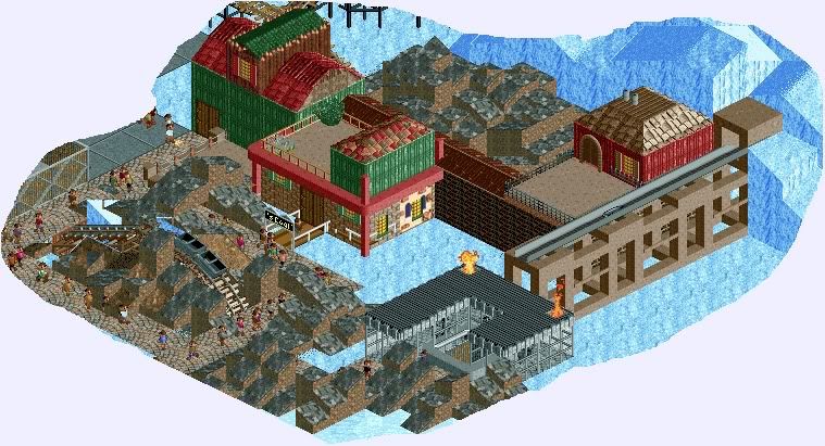
Second color option. I am personally a fan of this more, and it fits it's surroundings better.
-

 disneylandian192
Offline
Second color option. I am personally a fan of this more, and it fits it's surroundings better.
-
 Splitvision
Offline
Yes, I was just going to suggest a change of the coaster colour. Purple is perfect.
 -

 Dotrobot
Offline
That's a nice shape for that station pierrot. why not do it for the other side as well?
 -

 Faas
Offline
What is it supposed to be jag?
I see a dinghy slide, Spanish roofs and a lot of ice. I don't get it. -

 BelgianGuy
Offline
Pierrot, I think it would be better if you made a second but smaller awning like that aswell to give it a litlle bit more structure.
 -

 Casimir
Offline
CHANGE IT BACK TO BLUE! PURPLE AND YELLOW IS OVERUSED
rly?
Jag, you seem to be back to your kind of experimental building style. I liked your more defined pictures better. -

 Dotrobot
Offline
Jag. I gotta tell ya. Go for an easy theme something even you won't over do. Like a western section or something
 -

 nin
Offline
The blue/yellow combo made the coaster pop out, to stand by it's own. The viewer focused more/first on the ride before anything else. The purple/yellow makes the coaster blend well, and while it's easier on the eyes it loses the 'pop' that the blue had.
I'd suggest sorting minor color problems like the teal blue alongside the pool. I understand why its there, but it just keeps standing out in a bad way to me. (This is referring to the border of the pool, not the actual lining of the track in it.) -
 F0ndue
Offline
Jag,I think I`m the only one but I really like it for some reasons,I just have no idea what your theming could be...
 -

 pierrot
Offline
Dotrobot : your work alwalys special, but concepts is too confused
* I solve Ip error.
-

 robbie92
Offline
Jag, that looks really interesting. You're letting ideas shine through with more clarity. Awesome!
 -

 Phatage
Offline
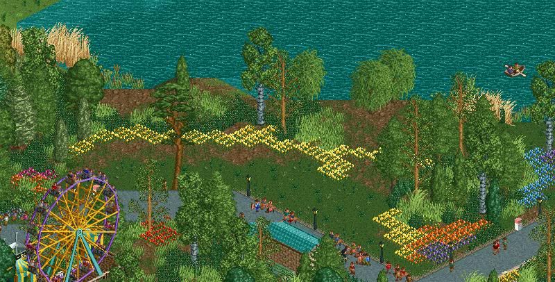
practicing with foliage.
I really like this screen. The types of trashcan and lamps you used, the more natural arrangement of flowers in that open space, the fact that there are no fences bordering the open space, inviting guests to step onto the grass if they wish, the oddly-colored Ferris Wheel, and that boat in the upper left really give this screen a tangible atmosphere. I also like that lone tree on the border of the diagonal path, just something about it that seems inexplicably real. The dirt under that paths would be fine if it weren't for the fact that we can't see it under the diagonal path, maybe using the darker brown land surfaces would make the path transition better to that open space. I think the middle of those three lamps is also one too many, and at night that open area would benefit from not being lit up too much for people who just want to relax on the grass, maybe watch some fireworks over the lake or the sunset or something. If you can make a gap in the flowers right below those two weeping willow trees next to each other, guests could go all the way to the water if they wanted to. -

 Dotrobot
Offline
Hooray for functional concerts. Finally got around to this idea.

still need to get around to importing custom music and stuff. 2 of the band members dont have an instrument. I'm still trying to figure out what's the best way to do a guitar.
EDIT: guess what type of music they play and you get saved game!
 Tags
Tags
- No Tags

