(Archive) Advertising District / Dump-Place
-
 19-April 07
-

 robbie92
Offline
Structurally looks great, Robbie. The colours are a bit dull, though... Maybe something other than the blood red for the track? (I know, sacrilege, right?)
I've actually tried a few other colors as well, but blood red makes it pop in ways that the others didn't. I could try more, but idk if any other color works as well. -

 Austin55
Offline
Dimi! I love your work so much dude, it's got this perfect realism style that I love. I just with you would release stuff sometimes (otherthan micro's) I still remember your fiesta and it had some awesome stuff in it.
 -
 Splitvision
Offline
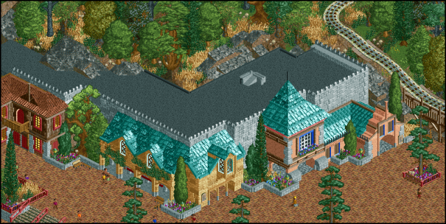
Sweet screen, dimi, though I think it'd look even better if the facades were less facade-y and more like actual buildings, if that makes sense. The grey brick wall running behind the facades are a bit too overpowering ATM, in my eyes. Really nice otherwise.
Speaking of facades

It's supposed to be the attraction named "Sagoslottet" (the castle of tales) at Liseberg. BTW, I'm havin some problem there. I'm gonna start a thread in ask the experts regarding this, but I thought I could just aswell mention it here too. When I open up my latest savegame of this, it freezes after about 2 seconds. No error trapper of nothing, just a freeze. I havent been able to figure out why, but it can't be any ride since they're all closed, so it must be the guests, or something. Actually, when I try to remove all guests with 8cars, my whole computer freaks out. So I guess that's where the problem lies. Has anyone experieced a similar problem? would love it if someone could provide me with some suggestions as to how to solve it. -

 pierrot
Offline
splitvision - Nice work! I like the structure. but in my opinion, it needs more color balancing
side project ( SONIC )


red box = highlight -

 dr dirt
Offline

Trying out some stuff for the snow fortress dream in Inception.
I'll post the fortress itself when I'm a bit farther on it. -

 Splitvision
Offline
Oh yes. I've been waiting for this. That looks really cool, and also is very reminiscent of how I remember that scene. What are the 1k half planks meant to represent though? They look pretty good lying there, just couldn't figure out what they were...
 -

 dr dirt
Offline
The wooden planks are skis. I'm still trying to find something more obvious for them, but they're alright I think. Thanks dude. Great screen btw.
 -

 Steve
Online
That looks fucking great, dr dirt! I think some snow covered pines would enhance the look even more.
 -

 K0NG
Offline
pierrot...I personally love that layout. Reminds me of something I'd make.
dirt...no idea what the concept is but the tunnel looks awesome.
Splitty...too many colors, IMO and the cjk roofs kinda hurt (I don't always hate them, but I'm not sure they work here). Maybe something steeper?
And a little something something from me just to show that I'm still at it: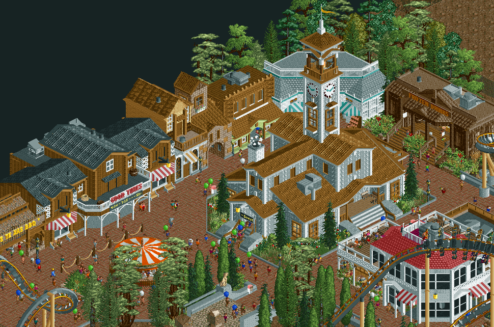
Part of "Vulture"...a design. Coming soon to an NE establishment near you. -

 Goliath123
Offline
Nah its a wingrider but its still fucking awesome! Love the Church? in the middle, you always make great stuff!
 -

 Splitvision
Offline
The archy and atmosphere is stupidly good there k0ng, but I feel some tweaking in the colour department would enhance it further. The brown/white/gray combination that is prominent in the left-center-ish portion of the screen is just a tad bit too much IMO, perhaps try to add splashes of accent colours in spots there.
 -

 Liampie
Offline
This page is fantastic.
@pierrot: I like the coaster, nice interaction with the lifthill. I'm not a fan of the hill over the transfertrack though...
@dr_dirt: I love it. Only snow covered trees could make it more awesome.
@Splitvision: Very good, I only suggest to redo the central tower. It doesn't look like the real one yet.
@K0NG: JUST FINISH
The 'Good Times' building is incredible!
 Tags
Tags
- No Tags
