(Archive) Advertising District / Dump-Place
-
 19-April 07
-

 Cocoa
Offline
Can't see anything, but I'm guessing those are custom supports for that mine track which is a coaster, not just trackitecture.
 -

 Comet
Offline
Zburns, that boardwalk area looks like it's straight out of Great Adventure, I like it.
Also, I for one really like that yellow coaster, sweet idea.
It's a shame you never finished it.
If you have any motivation to keep working on that please do so though. -

 Camcorder22
Offline
^Maybe it isnt a shame he didnt finish it because it might have beat us
 . Well depending which round anyway.
Coasters on cliffs kick ass, I can see the Superman Krypton Coaster inspiration in the yellow one and the wooden one in Spain (forogt its name) in the wood one. You pulled it off well too, hope you can finish it.
The rock climbing wall is a creative idea too.Edited by Camcorder22, 13 January 2008 - 08:02 PM.
-

Rhynos Offline
Anyone remember this pic from a park of mine I never got to finish about 3 years back?
Anywho, I thought of reviving that park, or at least that part of the park. It'll prolly just be that area if anything, but I wanted to get your guys' ideas on it. I know it looks rough, but, again, it was 3 years and I wasn't accustomed to most of the custom scenery out there (and now there's about 100x more). So, comments would be appreciated.
Oh, and if you were curious, I believe the idea behind this was an abandoned mine setting, if I'm correct. And yes, foliage isn't my forte, I know.Edited by Rhynos, 14 January 2008 - 06:25 AM.
-

 RCTNW
Offline
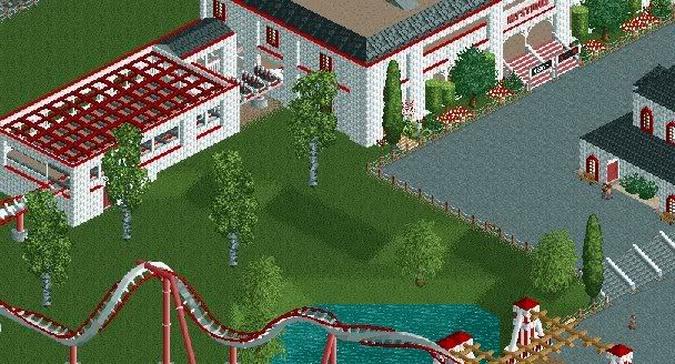
woofenskid – Normally I like the grass look however this is not working for me. 1 – The supports need a stronger base than grass. Use the rock or dirt textured land surface. 2 – The two different reds on the coaster are clashing pick one but not both. I also agree with turtle in that the colors are not working well together Hot sure what to suggest as we don’t know what it is about. The building shows potential but be careful you don’t get into the “blocky blues”.
Keep going though. It shows potential
James - rctnw -

 Camcorder22
Offline
woofenskid-The main problem I see with your work is that it always seems to follow a color scheme. Like the ride, station, surrounding scenery, and even flowers have the same colors. It would probably look a better if you changed colors for every different aspect, especially since most bricks aren't white and red.
 -
![][ntamin22%s's Photo](https://www.nedesigns.com/uploads/profile/photo-thumb-221.png?_r=1520300638)
 ][ntamin22
Offline
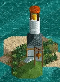
pineapple- not sure why no one has mentioned this but that's a gorgeous lighthouse.
JJ- see MA's comment.
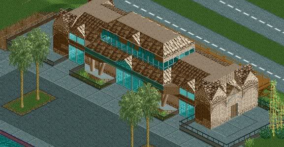
Rhynos- nice use of the catwalk pieces... maybe too brown, but i actually really like the structure. not so keen on the path. solid color might work better there.
nin- too brown, but very nice. since it looks like you're going realistic, how about some floodlighting on that wall with the external door?
 Tags
Tags
- No Tags

