(Archive) Advertising District / Dump-Place
-
 19-April 07
-

 ACEfanatic02
Offline
Deserves to be brought to this page.
Just somethin' I'm doing...
Excellent, Drew. Finish it!
-ACE -

 JDP
Offline
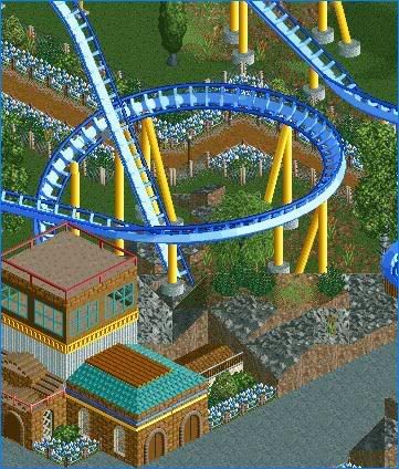
Well drew. If I was going to an Amusement park and were going through the parking lot looking for a place to park. That coaster will reach out and pull me right to it. It is a risky test with you using those colors, however you have pulled it off! Nicely done.
And TE. I bet you any money that if you would release a mini and a decent sized solo, you will get a parkmarker spot... or get close to it!
-JDP -

 Ride6
Offline
Sink the ride? Silly RCT2ers...
Codex?
And the colors in Drew's screen don't "work" for me. The teal on the building screws it up. Without that teal all would be at harmony, as is it just distracts from the blue/yellow interplay.
Ride6 -

 Gwazi
Offline
Just noticed, RMM, on your screen there is a bench on some path-rooving near the bottom-right that prolly shouldn't be there.
-

 tracidEdge
Offline
built before codex mother fuckersCodex?
beast trainer for the win (except not really anymore) -

 Midnight Aurora
Offline
Ride6, as tracid said, Beast has an option to "Sink Scenery". Useful for hiding stuff underground (like the original way to make things invisable, popularized by Pawn.)
Beast is far from dead. I still use it for everything ride related. Codex is only better for scenery. -

disneylhand Offline
^Absolutely stunning. You've improved so much.
Disneylhand, all of those shots look superb. Excellent detail!
Thanks guys. Now If only ProDesigns was announced I could send it in...
-disneylhandEdited by disneylhand, 15 May 2007 - 11:19 PM.
-

 vekoma9
Offline
You could still send it into Kumba, for a design. You don't have to wait til they get called. Send it in lol.
 -
![][ntamin22%s's Photo](https://www.nedesigns.com/uploads/profile/photo-thumb-221.png?_r=1520300638)
 ][ntamin22
Offline
drew: too bright.
tE: looks mildly unfinished to me for some reason. ride is excellent as previously stated; cover up the ice cream stalls somehow, maybe raise some fence so only the counter is visible?
RMM: i like this. not particularly exciting, but very atmospheric. -

 tracidEdge
Offline
fuck that i like the ice cream stalls. that was the first area in that park that i actually finished.
 -

 Milo
Offline
RMM- nice screen man... nothing incredible but I like the atmosphere... and the fence idea is good too, especially on the roof there
Tracid- nice screen there... probably the best flat I've seen since Corkscrew heh...
(way back) MA- I like it... have anything to do with Sliced Bread? -

 Loopy
Offline
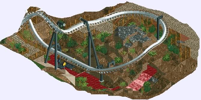
Back to RCT2 so just a little unfinished teaser.......
It is an (attempted) recreation but what is it.... -

 Loopy
Offline
This is my intention. Ive always loved Nemesis and ive always wanted to recreate it in RCT and do a better job than all of the others out there.
Ive attempted to do it numerous times before but this time im actually feeling it and it just seems to kind of build itself. Im trying as hard as i can to stick with what its like in real life (in things such as support placement etc) its just extremely hard without the diagonal inversions. I think ive finally found a layout I like but it may need some more tweaking in the future.
As for the landscape the quarter tile land blocks are being a major help in this so i think im going to be making the whole landscape out of the small blocks where possible. I hope to have this finished fairly soon so keep youre eyes out for it.
 Tags
Tags
- No Tags


