(Archive) Advertising District / Dump-Place
-
 19-April 07
-

 Kumba
Offline
I had a look at a lot of backyard coasters before starting and blue flash was the one I thought would work best in RCT. Still it's not a rec... just atm everything in that screen is the same (other than the car), but when it's done I don't think it will look like a rec, or even still be blue.
Also sorry Liam, I know it's annoying when that happens. If you want maybe we can team up on yours or mine? I really just made it as a "if needed" entry for an MM round. -

 djbrcace1234
Offline
Trying to work on an 'okay' looking Gotham Backlot for my Riddler Revenge knockoff Design.
Any suggestions, or should I just try and build more of this style? Quite honestly Archy is my weak point and I'm still unsure about it.
-

 Austin55
Offline
Hey thats pretty neat. I'll comment since I love these SF parks.
First up, get rid of that crap custom scenery ? and make your own somehow, it will look more natural in the game.
Second, Work on your foliage. It kinda sucks try and use more of the solid grass peices, and use grass under your tree's rather than sand.
Thirdly, this may be a personnal preference, but I wouldent use red in the bank. Try maybe grey, white or the dark gree.
fourthly, hire some handymen
fithly, maybe try and break up the path somehow, put some planters with trees, signs, theming, a batmobile, etc.

-

 Turtle
Offline
I like that, think it looks pretty classy. The drawback is that it is essentially a large block, which is a boring structure.
 -

 wildroller
Offline
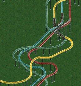
I've continued to work on the Quad Racer I posted a page back and now have a mostly complete layout, a couple areas need to be modified a little bit. I thought I would share a couple more screens while I start working on the supports/theming/footpaths of this ride. The ride turned out to be a little bigger than I had planned with the coaster ranging from 6300ft to 6600ft in length.
This is part of the rides finish, the tracks cross each other a few times before the final breaks!
And this last screen is an RCT2 overview shot, you can see the overall layout without seeing any real detail!
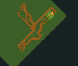
I might create a separate thread for this in a couple days if inspiration keeps coming to me and I can get a couple screens that look finished
-

 Splitvision
Offline
I'm not really feeling the flow TBH, I'd try to smoothen out the sections somehow. Although I realize that can be pretty difficult when dealing with a quad-dueller.
 -

 Midnight Aurora
Offline
Testing. . .

Figured I should put my money where my mouth is. This is my first attempt at this, so it's obviously a little rough, especially at the bottom. For all its imperfections, I definitely like the look of it better than the old school LL method, though. -

 K0NG
Offline
Yeah, you're definitely on to something there MA. Definitely unique and definitely nice.
 Tags
Tags
- No Tags


