(Archive) Advertising District / Dump-Place
-
 19-April 07
-

 Splitvision
Offline
It's huge IRL too. Not really that big though, I admit, but I had t do it that way to get the right shape of it. I'll try to bulk up the poles.
 -

 Goliath123
Offline
Nin, i like the little queue line in there and the tower in the foreground but idk what it is haha!
Split i like that, but yes you need more enforcement from the poles -
 Jaguar
Offline
Has my foliage gotten better?
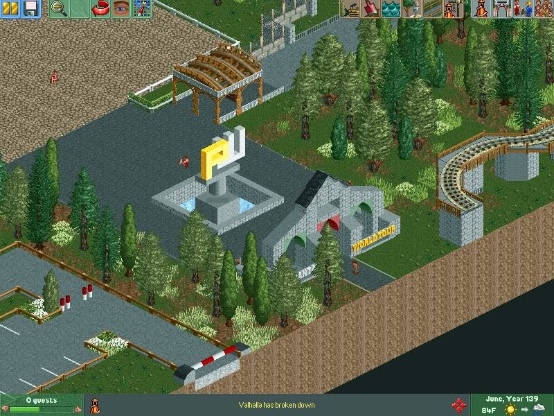
Note: Everything in this screen except for the foliage and archway are made by turbin3. -

 nin
Offline
Could clump it up a bit rather than the sparseness that's going on now. Mess arond with the tree colors more too.
 -

 Dotrobot
Offline
Yeah it has gotten better. But that combination of trees are eh. Some of the colors are off real badly and the floewrs just suck. Your color of the grass is diffrent too. These are things that you should know better to do jag. Plus there should be more lowlife. just surround the trees with a radius of lowlife.
Other than for the overload of that light green color it's nice. -

 Comet
Offline
No, that foliage is terrible, and the colors for the trees are way off
Let's try to start you off simple, just copy the foliage combo, color, and density you see here...
look at foliage
...just copy that for now. It's not the best but it's simple and much better than yours. After that I think you'll start to realize how foliage works and you'll be able to develop your own style
Foliage is such an easy thing to just not be terrible at. I'll admit I wasn't really good with it when I played, because I was lazy when it came down to it, but it's easy to get a basic idea of what looks decent. Like when have you seen anything like yours in a decent release, so why do you think it looks good when you do it -

 ACEfanatic02
Offline
Remember my point about not placing objects randomly? Yeah, that goes like triple for foliage. Try not to place the same tree with the same color scheme directly next to one another. Also work out your land textures -- hint: trees (especially pines) usually kill/stunt the grass under them unless it's being tended. So having a pine tree on grass surrounded by mud is a little *odd*.
(Oh, and for the trunks, use the light brown color; it will give you the original color of the trunks and doesn't look glitchy like the other browns do.)
-ACE -

 scarywaffles
Offline
dark green and white are not a good partner... you can use some citrus colors splitvision
 -

 Jaguar
Offline
turbin3 collabo? Ah, well the foliage still sucks, im with everyone above^^^
Not really, just finishing something old. I removed the foliage. I'm really still experimenting on my foliage, so if it sucks, I'll just remove it. -
 RRP
Offline
layering is how you make good foliage
http://www.nedesigns...id=5&map_id=196
look at how little trees are used on this map but they are in clumps which reduce in density from a central point -

 Comet
Offline
^I was gonna use that as an example but that's easy to mess up
jag, do you listen to anything other than the people who simply say it sucks, you seem to never acknowledge the actual advice that's given
 Tags
Tags
- No Tags

