(Archive) Advertising District / Dump-Place
-
 19-April 07
-
 Jaguar
Offline
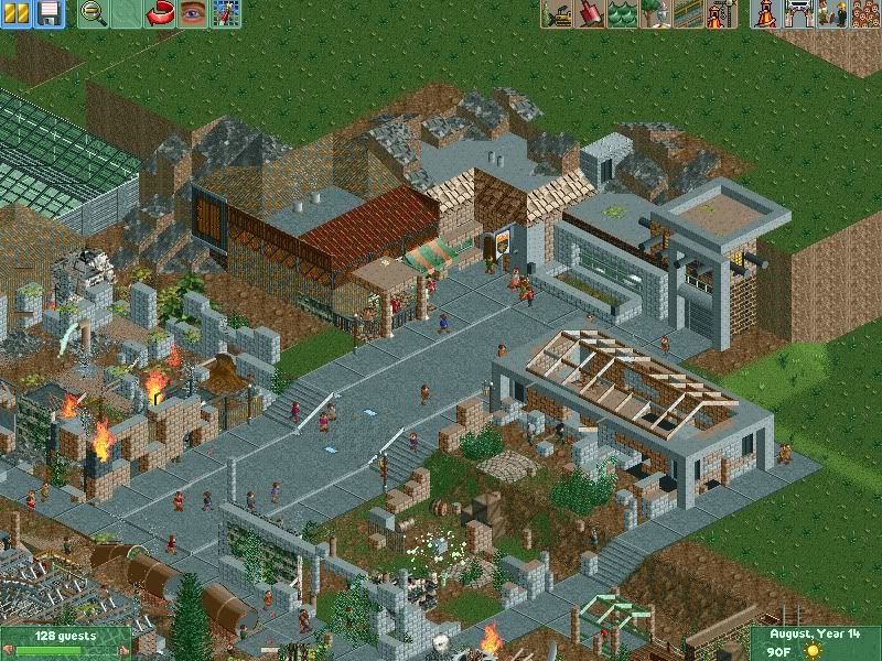
Well, I saw your design, and it is pretty decent, the problem is the park is way too blocky, but I am not one to talk about that. Send me a PM and I can give you a guest spot, but not instantly because Dotrobot has the park.
Welshcraft, that support is not connecting, other than that, the screen is too unfinished to really give good advice on. -

 Wolfman
Offline
Maybe the keyboard shortcut (if it's been changed to an "F" key,) has been "F-LOCKED". My keyboard has an F-Lock to the left of the Esc key. If this is pressed, then the F keys are locked and useless. Just press it again to unlock.
Other than that, you may want to check out where the screenshot function is assigned as far as keyboard shortcuts is concerned. You might just be pressing a key that has no assigned function.
-

 spartan
Offline
Roomie I'm loving all this recent stuff you've put on here. It's gorgeous, you and jusmith make a good pair. Can't wait to see more.
 -

 SSSammy
Offline
oh jag. it has potential, but the overall composure is off as usual.
 i really wish i could help you and be more precise.
-

 Top Gun
Offline
I would say just clean it up a bit. There's just so much going on which is making it really hard to focus on what you are actually going for. The screen you posted earlier was probably your best IMO, because it was much more clean.
 -

 Jaguar
Offline
oh jag. it has potential, but the overall composure is off as usual.
 i really wish i could help you and be more precise.
Perhaps a guest spot?I agree, I'm honestly unable to give any specific advice.
It'll get cleaner, everything in that screen except for the shops are old.I would say just clean it up a bit. There's just so much going on which is making it really hard to focus on what you are actually going for. The screen you posted earlier was probably your best IMO, because it was much more clean.
I will, and I know my other screen was very clean, it is NCSO.I like that, Jag, especiall the markets etc in the top
Thank you
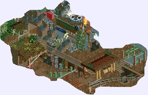
Here are some screens from earlier, no one commented on them, so I need to know if I should remove them or not.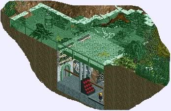
-
 tdub96
Offline
Idk, jag, I'm not feeling it.
Maybe you should try realism...like, actual realistic stuff. It might get you on the right track if you know what I mean. Just a thought. -

 Jaguar
Offline
Idk, jag, I'm not feeling it.
Maybe you should try realism...like, actual realistic stuff. It might get you on the right track if you know what I mean. Just a thought.
So I can spend another year making poorly supported coasters and honorary mentions. Realism is fun, but when you do it, you are limited. With fantasy, you can do whatever you want in a park as long as it is presentable, I am tired of seeing generic themed entrance plazas and (Intamin 1999) banners. Maybe my next park will be a realistic park, but not until I step up, get practice, and become a good park maker. -

 Liampie
Offline
Do you think EPWS and Legacies Themepark were boring? None of them were generic but still they're both realism. And my park didn't have ([manufacturer] [year]) tagged rides.
 -

 braztaz
Offline
Jag, what you have now is just too cluttered and you really should consider switching to realism to let your potential shine. Realistic parks are anything but boring. You can be realistic without having to be generically themed.
 -

 ACEfanatic02
Offline
Screw the "go to realism" stuff. Build what you want to build or you won't finish a damn thing.
However, there are a few things you can do to make your work more presentable.
- You're confusing "detail" with "object density". Don't *ever* look at something you built and say "that doesn't look detailed enough." Detail is not about cramming as many objects as you can onto a single tile. Instead, focus on the idea; what do you want this wall/building/garden, whatever, to look like? How can get the point across with the least number of objects? De-clutter. If it gets your point across, it does its job and you're only going to ruin it by adding more to it.
- Even if you're going for a chaotic look, don't place objects at random. Let's use foliage as an example: you never see bushes and trees thrown around randomly; they clump together in patches. This gives you areas that are more clear, that give the eye a chance to rest. That makes the busier areas look better.
- Go look up the Wikipedia article on Color Theory. Give it a read and apply it. Brown and green are an okay base, but they cannot be the entire color scheme for an area if you want to draw any attention to it at all. Don't build ruins; build "theme-parked" ruin, with brighter colors and a bit of thought behind them.
-ACE -

 Jaguar
Offline
Good point Ace. I was just explaining that I am not very good at theming, and would probably only be able to get a generic theme correctly. When I stated this park, I didn't want it to be an actual "park," and although plants grow in patches, invasive plants can really devour anything in their path. If someone wants me to do realism, I will. I am going to get this finished though and do what you said, I just want it to look more "real" and less "fake," as in I would like it to have a serious pale less cartoonish look.
 -

 That Guy
Offline
If I were you, I would take a break from the site, practice RCT, and then improve my attitude and self respect.
-

 K0NG
Offline
And, how do you plan on overcoming this deficiency? By avoiding it and sticking with what you 'know'? The only way you'll improve your theming is to tackle it head on. Work on it, show some screens and get feedback, then work on it some more. Same thing with your support work. Study real supports at RCDB or wherever you choose and practice it. Post screens, get feedback......Good point Ace. I was just explaining that I am not very good at theming.....
-

 ACEfanatic02
Offline
Tell me, did you actually read what I posted or not?Good point Ace. I was just explaining that I am not very good at theming, and would probably only be able to get a generic theme correctly. When I stated this park, I didn't want it to be an actual "park," and although plants grow in patches, invasive plants can really devour anything in their path. If someone wants me to do realism, I will. I am going to get this finished though and do what you said, I just want it to look more "real" and less "fake," as in I would like it to have a serious pale less cartoonish look.
If you want to get better at something, do it. You'll suck the first time. You'll suck less the second time. Eventually you'll stop sucking. That's how it works.
Don't build realism because someone says "hey, go build something realistic." That's not genuine motivation, and whatever you build with that as the reason will either be terrible or incomplete. Build what you want; if you want to build realism, go for it. If you want to build a park full of penis statues, have at it. As long as it's what you enjoy doing, you'll not only have more fun but you'll get better results.
Also, regarding colors, I wasn't saying to make everything bright and neon. But you can use a lot more of the palette than you do and keep the same feeling, but actually have some visual interest. I wasn't kidding about reading up on color theory.
-ACE -

 Comet
Offline
jag, you have the most annoying attitude towards the game to the point I gave up commenting on your screens
I'd try limiting yourself to simply posting screens for awhile. Then just read the comments you get and try to develop your skill. If you do wanna answer to the criticism you get, I'd stick to something simple like 'thanks for the advice', because when you try to explain yourself you come off as an ignorant prick
Also, listen particularly to people who have proven themselves to be better than you at the game, because you've been discouraged before by people like Dotrobot and you should probably actually be giving him advice
...and seriously...don't ask us what style you should build in, you're not here to entertain us, do what you want
 Tags
Tags
- No Tags
