(Archive) Advertising District / Dump-Place
-
 19-April 07
-

 Steve
Offline
That seems a little excessive.i'm not even joking, cocoa. i want to print that out and hang it in my room.
-

RMM Offline
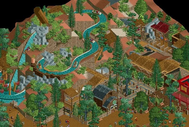
although i'd love to see more Cocoa, the building looks very poorly thought out and the transitions from one 'roof' to the next look horrible.
and everybody needs to get off this whole 'LL has no standards' thing or whatever it is. just because it's LL and it's nostalgic doesn't mean anything. sure, it's nice but it's painfully obvious that people over exaggerate the quality of a screen simply because it's LL. a good screen is a good screen, regardless of the game. i can post an above average rct2 screen and then post an average LL screen and it wouldn't surprise me one bit if there were more 'positive' comments for the LL screen.
maybe there's more criticism for rct2 because it's the more popular game. i just like to rant .
.
-

 Cocoa
Offline
well I am glad you approve sssammy...
^definitely agree, always good to get some criticisim -

 Comet
Offline
and everybody needs to get off this whole 'LL has no standards' thing or whatever it is. just because it's LL and it's nostalgic doesn't mean anything. sure, it's nice but it's painfully obvious that people over exaggerate the quality of a screen simply because it's LL. a good screen is a good screen, regardless of the game. i can post an above average rct2 screen and then post an average LL screen and it wouldn't surprise me one bit if there were more 'positive' comments for the LL screen.
Coming from someone who hasn't opened LL since RCT2 came out, I completely agree
I give more credit to LL screens because I don't know how to play it, just like I'd give credit to someone who's good at some random online racing game
People are more critical of a game they're good at, and most people here are better at RCT2
Therefore I do think LL gets judged a little more lightly -

 BelgianGuy
Offline
As for LL or RCT2 I don't give a damn, as long as the screen shows aesthetics that are pleasing and is well composed I don't care wich game it is basically its not good because its LL, a screen is good because it has atmosphere, flow, aesthetic value, nice little details and such... doesn't matter to me wich game it is and I don't get jizzed up because of a seriously hacked LL screen, I don't play LL but its a tool like any other that is used in RCT2 aswell for some parts so I think both games are at the same level of difficulity nowadays and both have their strenghts and weaknesses
 -

 Wolfman
Offline
I bought a better PC to play RCT 2 & 3. I'm not going back to the limitations of RCT LL when all I could of dreamed about was playing in 2 & 3. LL just reminds me of the cheap Compaq 2200 I used to own. What a piece of unupgradable crap.
 -

 Comet
Offline
Screen actually makes me wanna go to Disney
I'm a little confused by the gray stone everywhere though
I think it would actually look great if you made them a more natural tone -

 nin
Offline
I'd suggest more grass, actually. More of a 'step-styled' landscape rather than the Big Thunder style. Granted, that's mainly me and my overall outlook on the Splash Mts., going strictly by the Tokyo Disney version and art from the 90's.
-

 Jaguar
Offline
SRF, that screen looks extremely awesome, one of the best I've seen for a while, the only thing I don't like is the bright firetruck red on that building's roof in the far right.
 -

 Dotrobot
Offline
From this angle it does look a little TOO jagged. Maybe smooth it out and have some 1/4 landblocks.
 -

 Roomie
Offline
Offshore again and back in the groove

an extended Maurer Sky Loop near the entrance
Geewhzz Flyer which needs some custom supports at some point
The water splash. -

 Fizzix
Offline
Wow. Very nice Roomie. Love that flyer so far.
Cocoa, I love your screen as well, even though i don't play much LL.
Bob, good to see you over on NE finally!
Some work from me.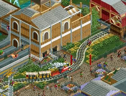
-

 Liampie
Offline
You're back! Great screens. I think your foliage can improve though, it doesn't look like much thought went into it... I'm sure you can make it look better. I'm NOT sure if I like the wooden roofs in the first screen. Does it fit the rest of the area?
But still, great screens overall. I like this traditional stuff much more than your extremely hacked experimental designs!
Why didn't you post this in your topic? -

 nin
Offline
I really like the train interaction, Fizzix, but the building seems to have too many textures and still is more of an 'organized random' look than it needs be.
 Tags
Tags
- No Tags


