(Archive) Advertising District / Dump-Place
-
 19-April 07
-

 Liampie
Offline
@Dotrobot: This screens asks for more land elevation. And less cacti.
@SRF: I love it. Although I'm not sure what I'm looking at, for example the brick stuff (reminds me of ivy, wtf ) and the debris down the drop, but it looks good for sure. The foliage could use some work. This long grass never looks good without surrounding bushes because it's so square. Indeed, I think your foliage is blocky.
@Coupon: I think that drop is very ugly. Doesn't a large turn down fit here? -

 highroll3r
Offline
just a little progress on fiesta forest. this is the latest area of my park. the millwoods.
 -

Colorado-Fan Offline
I really lie that screen Turbin3, like I already told you on ICQ. I think the architecture is the best you've done so far.
-

 Dark_Horse
Offline
Wow, Turbin3. That screen reminds me of Highball's Disneyland, but you added your own style which is awesome.
Colorado-Fan, that looks pretty good, but I'm not sure about the tip of the gazebo. -

 robbie92
Offline
C_Fan, haven't you posted that a while ago? It seems so familiar.
SRF, that's the closest to Splash Mountain I've seen in RCT yet. Great job!
Turbin3, that looks very nice. I always love a good bobsled coaster! -

 scarywaffles
Offline
well, I've seen some of them, and it was really nice. some are inspiring while the others are just so amazing and really creative
 -

 In:Cities
Offline
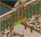
turbin, make the garden gnome have a blue shirt and somehow give him a red hat, and you've got a winner!
 -

 Goliath123
Offline
I dont think its a garden gnome, just a peep walking through the box on path by coincidence, but if it is, its very good idea. I really love the screen too, especially the building on the right with the little "turret".
CF also very nice screen! -

 Liampie
Offline
Why would Turbin put path through the flowerbox? I'm pretty sure he did this on purpose...
 -

 Goliath123
Offline
because it a quarter tile object and the path is a whole tile so its not really noticeable, also on closer inspection the "gnome" is right in the corner of the box but if it was an object it would be in the center, very suspicious indeed imo.
And in his hand you can see a drink =] -

 nin
Offline
Sorry Turbin3 and Colorado, while those screens are technically very well made, it's rather boring.
 -

 Dotrobot
Offline
I liked Colorado's really good. It's clean and simplistic while giving off a refreshing vibe. Just how an area like that would be.
 -

 Dotrobot
Offline
What is Slieng blewade?
Pssssssst!! Maverix.
this is a secret. I liek yo screen very moch. -

 djbrcace1234
Offline
The path blends in to much I think, and it just makes the white tiles drab looking because they don't pop out as much as they would with a darker, contrasted, color.
Overall, I like the overal facade for that building. Simplistic, yet nice to view.
 Tags
Tags
- No Tags


