(Archive) Advertising District / Dump-Place
-
 19-April 07
-

 Dotrobot
Offline
I am thourhgly confused about the bridge.. Whoa It looks so cool but counfusing.. The foliage is 'meh' everything else is charming.
 -

 K0NG
Offline
^ It's the brick path used. It doesn't slope properly like steps do so it all looks like it's at the same angle.
 -
 Timothy Cross
Offline
Whatever, something I started just for fun (while banned) and won't be finished... Ocean Cloud Resort @ The Discovery Center.
-

 BelgianGuy
Offline
SRF, it could use some work on the foliage but the rest looks pretty decent,
Fantastico, your work is intruiging to say the least but why never finish? -

 rK_
Offline
this foliage to me is much better, alot more "natural" then the previous sreen, very nice work!Well... that was fun to read. I kinda agree with the messy bit jaguarkid, but it's not my place to be saying anything.
Something...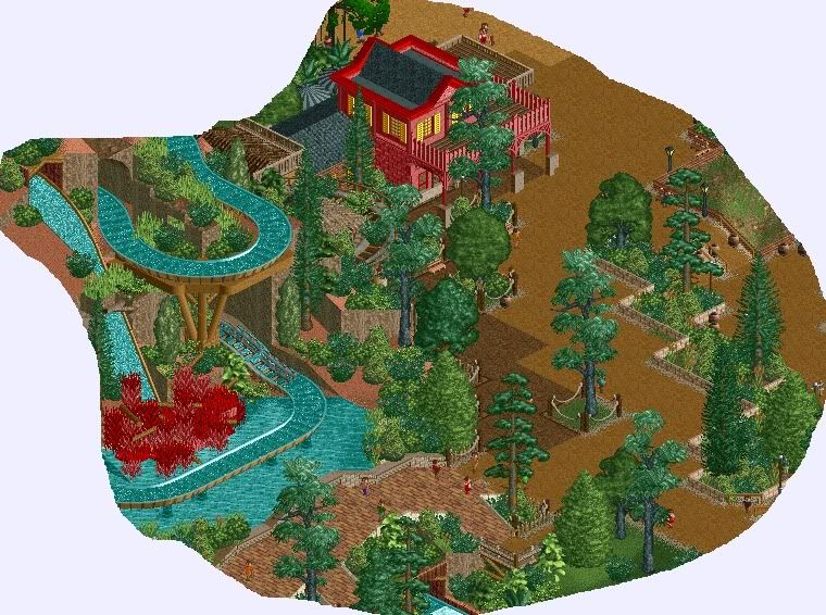
-Storm -

 Dotrobot
Offline
Everything's coming along fine on the park.
Ugh.. The station is missing a fence. I tend to miss a lot of little things these days. -

 Hex
Offline
I love the queue and the station. I don't care for the path going over the coaster before the lift hill, but all of the rest I really like a lot.
 -
 Jaguar
Offline
The foliage and roofs in the queue line aren't the best, use deco blocks for the roofs and those custom made tropical trees are pretty ugly, other than that, it is simplistic, but nice.
 -

 Dotrobot
Offline
^^
But remember. Most coasters have the exit on the other side of the station. There was not many ways around that. Don't worry the screen is very unfinished. I just wanted to show what i got done for today.
^
This park is located in Texas where there's a lot of tropical trees. And I like the deco art roof, it gives the station an open feel. But if another person doesn't like it I might change it.
BTW.. Old screen I have dug up that i neglected to show to NE.
-

 Dotrobot
Offline
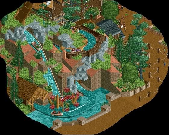
Whoa much better. but i liked the little support thing and the bobsleigh below the flume. But in overall improvement. It's better to me.
 -

 J K
Offline
So many great screens being posted. SRF I really really like your work. You always theme rides with a lot of thought and theming interaction which makes to an awesome theme park experience.
Dotrobot, keep working on your architecture with some more detail and I think you'll gradually grow into a strong player.
 Tags
Tags
- No Tags
