(Archive) Advertising District / Dump-Place
-
 19-April 07
-

 J K
Offline
Pierrot that is very nice to look at. As Turtle has said a whole coaster supported like that would be incredible.
SRF, thats a lovely screen but I don't like the slanted block as a roof texture for the red building, I need a different texture to look at to make it stand out. -

 Dotrobot
Offline
^
lol, But Dotrobot, I actually like the layout as it has that Texan Giant type feel to it, But K0ng is right about too many similar turns. Even Texan Giant has a change in direction towards the end.
That was what i was going for. But the layouts are lot different other than the break run and the first drop and turn around. This is my best layout so far.. And I'll fix the turns.. Somehow -
 JoeZia
Offline
A ride that turns in one direction would seem rather boring to me. I never liked wooden coasters that have fast turns, therefore make sure you always at the to of a hill or after brakes at the end. No sure how the speed is on that I'm just giving you a heads up on making woodens. The hurler at kings dominion nearly broken my neck because of it's fast turns (no joke).
 -

 Dotrobot
Offline
That's exactly what it's supposed to be. A rough tumbling woodie. Like texas giant before it got closed down for renovation.
 -

 Midnight Aurora
Offline
Perhaps you'd be better off on a Carousel?A ride that turns in one direction would seem rather boring to me. I never liked wooden coasters that have fast turns, therefore make sure you always at the to of a hill or after brakes at the end. No sure how the speed is on that I'm just giving you a heads up on making woodens. The hurler at kings dominion nearly broken my neck because of it's fast turns (no joke).
-
 Jaguar
Offline
^
Well, I really think I started a topic for this way too early, so until I get any progress and hear what everyone has to say so I can change it, remove it, or keep it the same, I am going to show this image: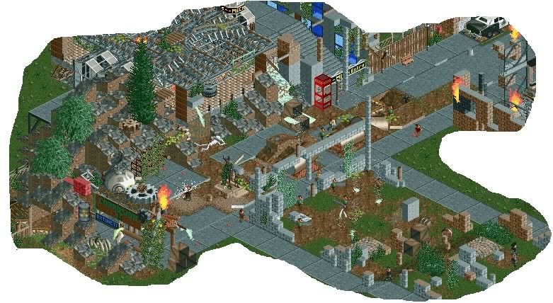
-

 Dotrobot
Offline
Too friggin messy.
I see a turning cogwheel some flames. A fire hydrant right next to it that's spurting out water. And then a pile of bricks on a rock pile. Than another moving cogwheel on a rock pile. IT looks like you just place bunch of shit objects in no order or meaning.
I'm being harsh but it's the truth. -

 Hex
Offline
I agree with Dotro, which is every time he gives out criticism because he is always correct. It is WAY too messy. THose little rocks take u a lot of space and then you throw random bricks onto the land onto the right-bottom corner. The roof on the ride at the top-left corner isn't working out either... However I do enjoy that you keep trying at new stuff, that is always good.
 -

 Jaguar
Offline
So does everything placed need some explanation. Maybe the cog wheel is powering the flame, maybe the fire hydrant was next to the street (like they usually are) and is spraying out water, the bricks are from a collapsed building, because that is what happens after a building is left alone for years, and maybe the flames are from a burning building, (this is an apocalypse, right?) Not everything has to be completely neat, forget the amusement park factor in this, because it is more fantasy, and about the overgrowth, if anyone has seen invasive species, then you'd know how they would devour cars, lakes, even entire buildings, so I don't think it is really that much of a big deal. Funny thing is, you seem to search for every screen I post and try to pick out every little thing you think is wrong about it.Too friggin messy.
I see a turning cogwheel some flames. A fire hydrant right next to it that's spurting out water. And then a pile of bricks on a rock pile. Than another moving cogwheel on a rock pile. IT looks like you just place bunch of shit objects in no order or meaning.
I'm being harsh but it's the truth. -

 JoeZia
Offline
I agree as well. That nonanimated fire have got to go as well. I'm ironically working on an object right now that is probably what you need.
 -

 Dotrobot
Offline
WHAT I POSTED ON YOUR WHAT'S BETTER THREAD:
Detail isn't the problem. It's just that you do it in such a messy way that the intial purpose gets lost.
Like that 3rd screen. It's executed cleanly and nicely. But that doesn't mean you can't have innovative ideas as well Jag. Like that tower in the 3rd screen (I'm not sure on what that is) But if you put that in a jungle, western, or mine themed area that's executed in a more clean realistic style. It'd look great!
The key to the game isn't putting so much detail and ideas that it would only look good in your eyes. Take example the 4th screen. What the hell is that? I see an explosion, and a bunch of meaningless things that the screen gets lost so much!! It's like you took a random scenery object and started clicking it everywhere. Switched it to another scenery object and did the same.
But the 2nd screen is an excuse for underdetailed looks better. It's so simple that it's too simple. However the 1st screen is amazing.
I'll give you some tips Jag. Because "You do you" will not help you. Because you thrive on appraisal and comments. That's okay it's not like everybody JUST plays for fun on here.
1. Carefully choose your objects. Don't just pick what's cool and what's not. Because 2 cool objects right next to each other might look like crap. Choose objects that compliment each other.
2. Don't be repetetive, but that doesn't mean that every building has to be completely different. Stay with the theme you're going for while not making it repetetive with same colors and textures.
3. Make the transition on your areas clean. Like one themed area to another. In Six Frag's newest spotlight. His transition from area to area was so clean and well executed. Do not copy his idea but do it in your own way that looks pleasing.
4. Overdetailed is fine. As long as it's done in a way that it doesn't get lost.
5. Always put something for a purpose. Like your newest screen in the dump. Nothing has purpose. It's just there because it's there. I know the theme you're going for and it must be hard to pull it off I imagine. But it's just TOO messy even if that's what you're going for it has no visual appeal.
6. Don't be afraid to take something out. If a building looks really cool but hurts the overall appeal of the area, take it out. The same building can always go to another place. If something even looks slightly off with the area in your eyes have no hesitation to pull it out and examine the area again after removal.
7. Just because lots of effort, detail, and ideas are present in the screen. It doesn't mean the screen is good, it has potential but in result it's how those ideas are executed in the end.
I know a lot of people might disagree with me. But this is just my tips and advices for you. Because I feel this is where you struggle the most.
DUMPPLACE:
Nice...Funny thing is, you seem to search for every screen I post and try to pick out every little thing you think is wrong about it.
Want me to stop posting on your work? Fine. I'm just helping you jag. You might think I'm writing these long ass criticism to embarass or be mean to you? You think that way jag. The sooner you get rid of that attitude that you're always right. The sooner you'll refine your work. It seems that the criticism gets never put in to use by you anyway. So I'll stop posting on your work jag. K?
Have fun doing whatever you want to do. Mr. Fraroc of rct2.
If you would read some of my posts. You will see I do this kind of criticism to a lot of people. So stop feeling sorry for yourself.
EDIT: Oh and the "invasive" species. Is that your go-to excuse? So beause a building has collapsed. Yeah that means clean picked bones, and radioactive barrels start appearing? What kind of world do you live in kid? -

 Jaguar
Offline
Have fun doing whatever you want to do. Mr. Fraroc of rct2.
If you would read some of my posts. You will see I do this kind of criticism to a lot of people. So stop feeling sorry for yourself.
EDIT: Oh and the "invasive" species. Is that your go-to excuse? So beause a building has collapsed. Yeah that means clean picked bones, and radioactive barrels start appearing? What kind of world do you live in kid?
I will take your suggestions in the future, but with the clean-picked bones, it is pretty much expected that anything would rot after a large period of time, the barrels are part of the ride sign, but it seems as if I should take them out. I am just annoyed because whenever I post a screen, someone always complains about a single or a couple small objects ruining the screen. I am having trouble getting the perfect screen, and when I make a shitty screen in a couple of minutes with out of date objects, people consider it my best screen ever. I can't understand how to get the good atmosphere and skill that other people get, I keep on experimenting and experimenting, and still can't find a flow. It is just pissing me off that I am still having trouble. I think it would be best if I took a break from NE, that should help keep me focused because I try too hard and need to relax before I dig my own RCT grave. Also JZ, the fires aren't animated, and for Coupon's screen, it looks great, but doesn't seem too interesting. -

 K0NG
Offline
I think part, or most, of your problem jag...is that you seem to always go for some kind of extravagant theme. Which is fine if you can pull it off. But, you need to be able to 'master' a simple theme first. That's why people seem to like your "shitty" screens more...because you're closer, execution-wise, in those screens. I'd suggest trying to complete something that's more basic, theme-wise, and try for some coherence. Even if it seems boring to you to create something more simplistic, if you can finish something that flows...it'll help you in the long run. It's like a mediocre guitarist that wants to jump straight into playing solos....all the desire in the world isn't going to help if you can't execute the basics first.
 -

 Turtle
Offline
"Generic" isn't a theme! Christ!
Also, Coupon, it's nice, but I have honestly seen tiny buildings like that a thousand times before, it doesn't make me interested at all. -

 Jaguar
Offline
"Generic" isn't a theme! Christ!
I'm sure you can consider it one, White isn't really a color, but people say it is. -

 StormRunnerFan
Offline
Well... that was fun to read. I kinda agree with the messy bit jaguarkid, but it's not my place to be saying anything.
Something...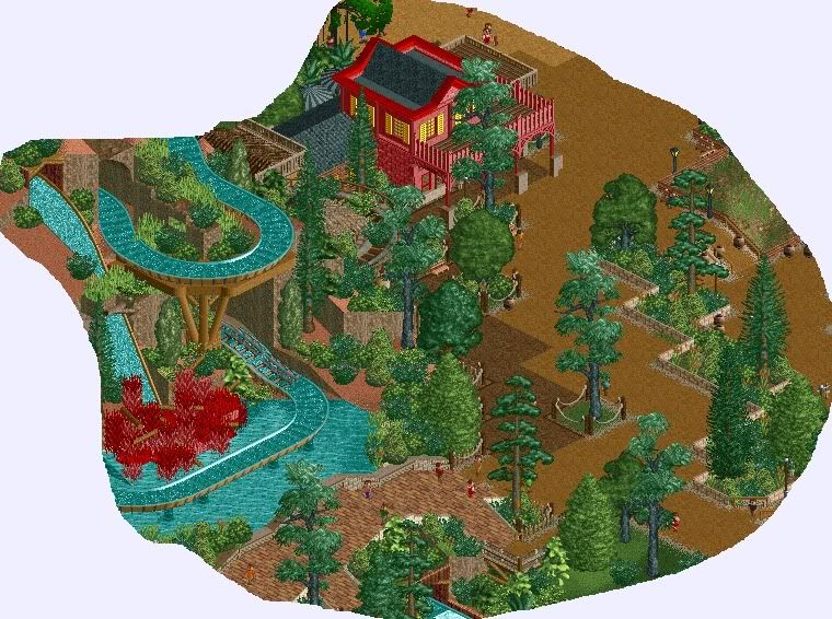
-Storm
 Tags
Tags
- No Tags
