(Archive) Advertising District / Dump-Place
-
 19-April 07
-

 Wolfman
Offline
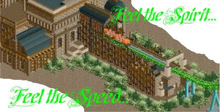
I remember when nearly all the parks were made of stone objects. No, seriously, all the parks submitted to NE a couple years back were usually stone. Everything... stone and sand surface texture. At least I remember it that way... or it was the color of stone. I call it the NE Stone Age. (Man that was boring.) And so is this. Boring. Very little colors or other textures to speak of.
Now all I gotta do is wait for everyone to make parks out of ice.
-

 Steve
Offline
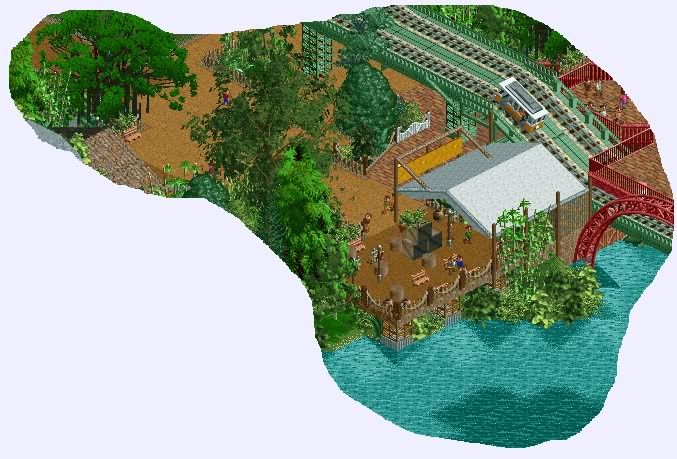
I actually feel like the foliage is working well in that picture. I really like the outpost with the canvas roof, too. Great stuff.
Fizzix, its looking like Rivers of Babylon to me so I applaud you for that. -

 Wolfman
Offline
Foliage looks fine to me. What looks out of place is the red track arc to the right.
 -

 Liampie
Offline
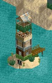
You made the crap objects work, so well done. The crates aren't working however. I'm looking to the rest of the park. You're one of my favourite parkmakers at the moment!
 -

 Fizzix
Offline
Love the building. I would say to change up the ground type a bit, it doesn't look good all the same texture. Other than that, great!
 -

 J K
Offline
Nice to see a new object used so well. I too think you should change the land to help the archy out slightly. Foliage is good but for the african land perhaps throw another contrasting shade like a light brown in there.
 -

 Wolfman
Offline
Maverix, I like the idea that you've already taken on Cheetah Hunt. And I have to agree, the land tile textures should offer up some contrast for the structures. But considering that there's darn little to go on where recreating Cheetah Hunt is concerned, about the best you can do is something that does something similar. But I imagine it's cool if you go with your own interpretation. Good luck. It's lookin' pretty good IYAM.
 -
 Evil WME
Offline
I never really understood why everyone finds these objects so crappy.. lovely to see someone put them to use. They are a bit harder to work with, though, I think.
 Tags
Tags
- No Tags

