(Archive) Advertising District / Dump-Place
-
 19-April 07
-

 Turtle
Offline
That's really nice. Really nice indeed. I'd like to see that developed into a whole area.
 -

 StormRunnerFan
Offline
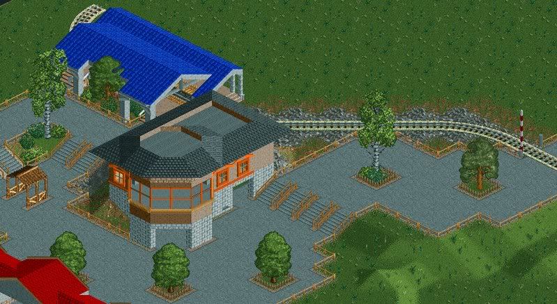
Pineapple: That looks great. The only thnig is the wooden building in the left middle of the screen. It looks randome.
Me: (AKA Noob) My new mini. Has an Asian theme. Tell me what you think!
Warrior
Warrior
Warrior: I would love swinging over the water
Warrior
Warrior
-NoobEdited by StormRunnerFan, 04 January 2008 - 03:28 PM.
-

 Comet
Offline
Pineapple, you've imprved about 100% over the past couple of months.
I love all of your recent work, it's great. -

 JDP
Offline
Hey pineapple, once you start fully completing things in that park, you should make your own topic in the add dis. It'll be nice to see.
-JDP -

 Cocoa
Offline
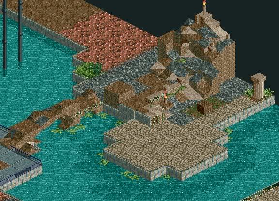
Interesting. The landscaping is sort of strange and crowded. And multicolored with sand, and rock, and dirt and dirt/grass, and leaf things, and bricks.
 -
 WallyWorld
Offline

Just trying to work on my buildings cause I know I stink at them. Most likely won't be a park. Hints/tips are much appreciated as long as they are not too rude because I already know I'm not as good as most here. Just try'in to get better.
-

 Lloyd
Offline
^ Try telling that to Jkay.
Fuck things having to be 'realistic' all the time. The colours look fine. -

 Liampie
Offline
Your colours are far too bright and aren't realistic.
Colours are always realistic.Edited by Liampie, 05 January 2008 - 09:09 AM.
-

 Sulakke
Offline
That's true. But I mean these aren't logical. You could better use other colours, it will look better.Colours are always realistic.
-

 Cocoa
Offline
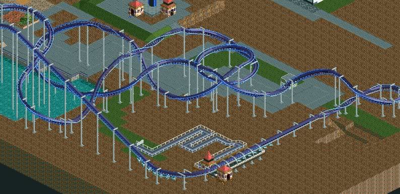
B&M Flyers are painful on your back. That curve would kill.
The layout is OK, but you used the in-line twist way too much and you also used the medium-banked-up/down curve/hill way too much.
The first drop would be fun though. -

 zodiac
Offline
Ok, so this one is the red one I showed a few pages back, the one now labeled 'Silhouette'.
And guess what? I'm gonna finish this one. -

 FredD
Offline
I would place some plants/trees/flowers on the grass on the
bottom of the screen. Also, use some other fence, in another
color, for the paths. And that black piece of land beneath the
station doesn't look nice...
 Tags
Tags
- No Tags


![][ntamin22%s's Photo](https://www.nedesigns.com/uploads/profile/photo-thumb-221.png?_r=1520300638)
